React: Modals With Portals
GitHub Repos
Intro
We will continue here working on our Twitch Clone Project called "🏷️ Glitch". In this post we are going to create a modal for users to confirm their action of deleting a stream.
The Problem of Traditional Modals in React
Some people feel that traditional modals in React are difficult because of the problem of z-index stacking context
In short, when we have a modal that is deep within the structure of an application, if there is any element on top of it in the DOM tree that creates a stacking context, the modal would not be able to assert itself visually on top with a higher z-index.
We could solve this problem by creating a modal component at the top of the DOM tree, perpendicular to the root div, that takes content as props and is shown conditionally using some sort of state trigger.
And in fact, that is essentially exactly what portals are doing.
Uses For Portals
Although modals are the most common use case for portals they can also be used for working with 3rd party libraries that may not play well with your CSS.
Scaffolding a Portal
To start with we make a div that is perpendicular in the DOM structure to the main root element. The ID can be whatever you want, here we will call it modal.
<!DOCTYPE html>
<html lang="en">
  <head>
    <title>React App</title>
  </head>
  <body>
    <!-- application root -->
    <div id="root"></div>
    <!-- modal container -->
    <div id="modal"></div> // highlight-line
  </body>
</html>
And then you will create a component very similar to App.js component, in the sense that you must import the ReactDOM and provide a second argument on the return that targets the html element in the index.
import React from 'react';
import ReactDOM from 'react-dom'; // highlight-line

const Modal = props => {
    return ReactDOM.createPortal(
        <div className="ui dimmer modals visible active">
            <div className="ui standard modal visible active">
                Modal Content
            </div>
        </div>,
        document.querySelector('#modal') // highlight-line
    );
};

export default Modal;
And our CSS styling for the modal is just Semantic UI, as it has been for this whole project so far.
Implementing The Modal
To use the modal we simply need to render the modal component now. In this case we are going to be using the modal inside of the StreamDelete component. Which would look like so.
import React from "react";
import Modal from "../Modal";

const StreamDelete = () => {
  return (
    <>
      StreamDelete
      <Modal />
    </>
  );
};

export default StreamDelete;
We already have created a Route on the delete button that renders the StreamDelete component. Therefore clicking on delete will render our modal for us.
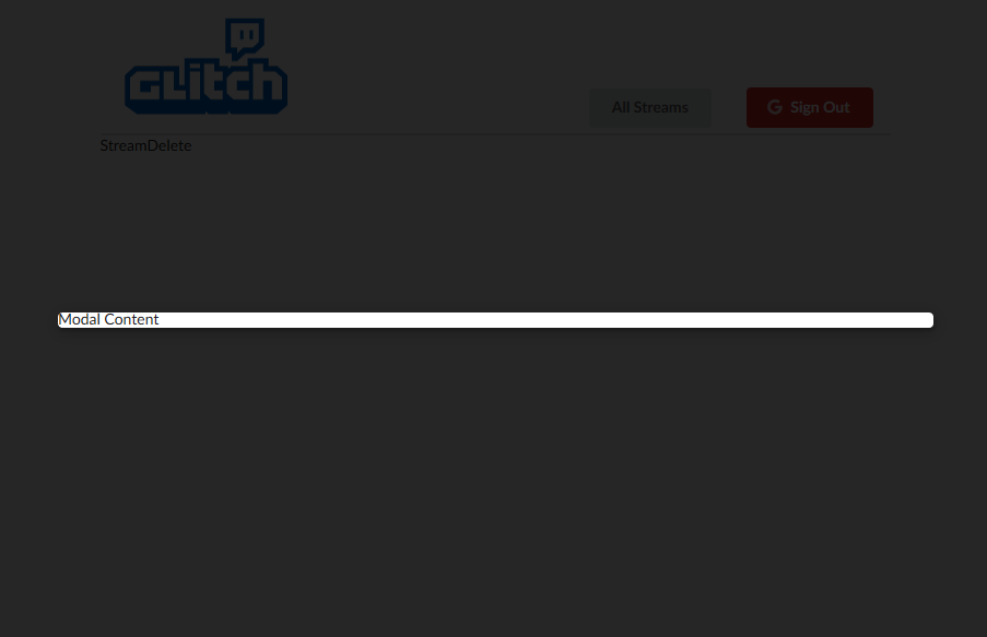
It has no content and there is no way to close it, but it's there. At this point we have fully explained the concept of the portal, and everything after this is going to be modal specific styling.
Styling the Modal
A lot of the styling here will not make sense unless you review the Semantic UI Modal documentation.
First let us add more content and styling to the modal, and then we can go through the process of toggling modal visibility.
import React from "react";
import ReactDOM from "react-dom";

const Modal = (props) => {
  return ReactDOM.createPortal(
    <div className="ui dimmer modals visible active">
      <div className="ui standard modal visible active">
        <div className="header">Delete Stream</div>
        <div className="content">
          Are you sure you want to delete this stream?
        </div>
        <div className="actions">
            <button className="ui primary button">Delete</button>
            <button className="ui button">Cancel</button>
        </div>
      </div>
    </div>,
    document.querySelector("#modal")
  );
};

export default Modal;
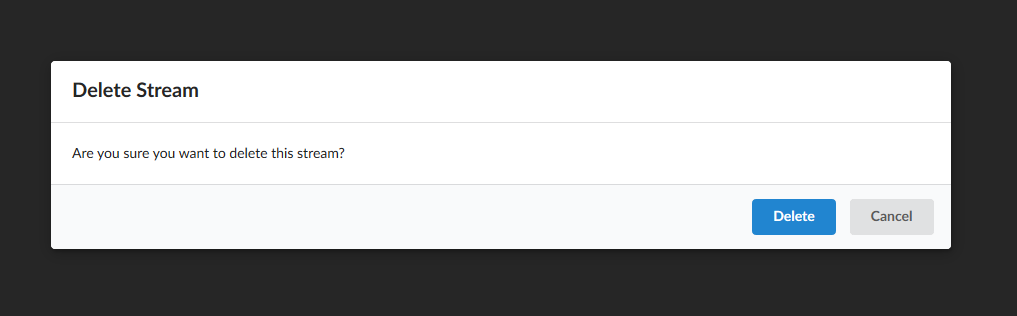
Which gives us this.
Hiding the Modal
In order to hide the modal by clicking on the dark background div, we are going to use programmatic navigation like we learned here.
Remember that in this case we are viewing the modal because we have navigated to /streams/:id/delete and so to remove modal visibility in this case we are going to navigate back to the stream list. In another case you may close the modal by toggling the active class on the modal elements.
If we want to stick with the principles of programmatic navigation that we described in this article React-Router: Programmatic Navigation we could do the following.
import React from "react";
import ReactDOM from "react-dom";
import { Redirect } from "react-router-dom";

class Modal extends React.Component {
  state = {
    toDashboard: false,
  }

  handleClick = () => {
    this.setState(() => ({
      toDashboard: true
    }))
  }


  render() {
    if (this.state.toDashboard === true) {
      return <Redirect to='/' />
    }

    return ReactDOM.createPortal(
      <div
        className="ui dimmer modals visible active"
        onClick={ this.handleClick }
      >
        <div className="ui standard modal visible active">
          <div className="header">Delete Stream</div>
          <div className="content">
            Are you sure you want to delete this stream?
          </div>
          <div className="actions">
            <button className="ui primary button">Delete</button>
            <button className="ui button">Cancel</button>
          </div>
        </div>
      </div>,
      document.querySelector("#modal")
    );
  }

};

export default Modal;
Note that we hade to create a click handler function that toggled a piece of state that conditionally rendered the redirect component. I had some trouble with this initially and had some alternatives suggested to me on Stack Overflow.
In short, some people think that it is best to manipulate the history object to redirect in certain cases.
Prevent Event Bubbling
At this point we still have a ways to go. The modal will close if we click on the dark background, but it will also close if I click on the modal window itself. This is because there is no event handler on the modal window, so the action is bubbling up to the nearest element that has an event handler. To take care of that let us quickly prevent event bubbling on this modal window.
import React from "react";
import ReactDOM from "react-dom";
import { Redirect } from "react-router-dom";

class Modal extends React.Component {
  state = {
    toDashboard: false,
  }

  handleClick = () => {
    this.setState(() => ({
      toDashboard: true
    }))
  }


  render() {
    if (this.state.toDashboard === true) {
      return <Redirect to='/' />
    }

    return ReactDOM.createPortal(
      <div
        className="ui dimmer modals visible active"
        onClick={ this.handleClick }
      >
        <div
          className="ui standard modal visible active"
          // prevent event bubbling
          onClick={ (e) => e.stopPropagation() } // highlight-line
        >
          <div className="header">Delete Stream</div>
          <div className="content">
            Are you sure you want to delete this stream?
          </div>
          <div className="actions">
            <button className="ui primary button">Delete</button>
            <button className="ui button">Cancel</button>
          </div>
        </div>
      </div>,
      document.querySelector("#modal")
    );
  }

};

export default Modal;
So now we can close the modal, however we still have a ways to go here. The delete button isn't actually triggering a delete action, the modal content should be getting passed in as props, and now that we think about it, the redirect to close the modal should probably be triggered by an action also. Let us keep going here. Let's start by making this component re-usable by passing in the hard coded sections as props.
Making the Modal Re-usable
Simple Props
We can start with the easy stuff, let us just pass in the hard coded text as props first. We start by going to the StreamDelete component where we are rendering the modal and we add some props to the modal.
import React from "react";

import Modal from "../Modal";

const StreamDelete = () => {

  return (
    <>
      <Modal
        title="Delete Stream"
        description="Are you sure you want to delete this stream?"
      />
    </>
  );
};

export default StreamDelete;
and then we extract those props in the modal component.
import React from "react";
import ReactDOM from "react-dom";
import { Redirect } from "react-router-dom";

class Modal extends React.Component {
  state = {
    toDashboard: false,
  };

  handleClick = () => {
    this.setState(() => ({
      toDashboard: true,
    }));
  };

  render() {
    if (this.state.toDashboard === true) {
      return <Redirect to="/" />;
    }

    return ReactDOM.createPortal(
      <div
        className="ui dimmer modals visible active"
        onClick={this.handleClick}
      >
        <div
          className="ui standard modal visible active"
          // prevent event bubbling
          onClick={(e) => e.stopPropagation()}
        >
          <div className="header">{this.props.title}</div> // highlight-line
          <div className="content">{this.props.description}</div> // highlight-line
          <div className="actions">
            <button className="ui primary button">Delete</button>
            <button className="ui button">Cancel</button>
          </div>
        </div>
      </div>,
      document.querySelector("#modal")
    );
  }
}

export default Modal;
Buttons As JSX Fragment Prop
We can also pass in the buttons as a JSX fragment prop like so.
import React from "react";

import Modal from "../Modal";

const StreamDelete = () => {
  const buttons = (
    <>
      <button className="ui button negative">Delete</button>
      <button className="ui button">Cancel</button>
    </>
  );

  return (
    <>
      <Modal
        title="Delete Stream"
        description="Are you sure you want to delete this stream?"
        buttons={buttons} // highlight-line
      />
    </>
  );
};

export default StreamDelete;
import React from "react";
import ReactDOM from "react-dom";
import { Redirect } from "react-router-dom";

class Modal extends React.Component {
  state = {
    toDashboard: false,
  };

  handleClick = () => {
    this.setState(() => ({
      toDashboard: true,
    }));
  };

  render() {
    if (this.state.toDashboard === true) {
      return <Redirect to="/" />;
    }

    return ReactDOM.createPortal(
      <div
        className="ui dimmer modals visible active"
        onClick={this.handleClick}
      >
        <div
          className="ui standard modal visible active"
          // prevent event bubbling
          onClick={(e) => e.stopPropagation()}
        >
          <div className="header">{this.props.title}</div>
          <div className="content">{this.props.description}</div>
          <div className="actions">{this.props.buttons}</div> // highlight-line
        </div>
      </div>,
      document.querySelector("#modal")
    );
  }
}

export default Modal;
Now let us replace our event handler as a prop.
Event Handler As Prop
We want to replace our onClick event handler as a prop, so let us go ahead and do that. I'm going to finally give in here and create my redirect my manipulating the React Router history object instead of rendering a redirect component. Let us start by adding a new prop to the modal called onDismiss.
Because my StreamDelete component was rendered using the Route components, I have access to all the React-Router props inside this component, and because of that I have access to history as a prop.
import React from "react";

import Modal from "../Modal";

const StreamDelete = ({ history }) => {
  const buttons = (
    <>
      <button className="ui button negative">Delete</button>
      <button className="ui button">Cancel</button>
    </>
  );

  // StreamDelete was rendered with React-Router
  // therefore has access to React-Router props
  const onDismiss = () => history.replace('/') // highlight-line

  return (
    <>
      <Modal
        title="Delete Stream"
        description="Are you sure you want to delete this stream?"
        buttons={buttons}
        onDismiss={onDismiss} // highlight-line
      />
    </>
  );
};

export default StreamDelete;
and we can then refactor our modal component to be so much simpler.
import React from "react";
import ReactDOM from "react-dom";

const Modal = (props) => {
  return ReactDOM.createPortal(
    <div
      className="ui dimmer modals visible active"
      onClick={props.onDismiss} // highlight-line
    >
      <div
        className="ui standard modal visible active"
        // prevent event bubbling
        onClick={(e) => e.stopPropagation()}
      >
        <div className="header">{props.title}</div>
        <div className="content">{props.description}</div>
        <div className="actions">{props.buttons}</div>
      </div>
    </div>,
    document.querySelector("#modal")
  );
};

export default Modal;
and I can then add the same onDismiss callback to the cancel button in StreamDelete. However I will need to make sure that I move the definition of onDismiss above this fragment, otherwise it won't be available to it.
import React from "react";

import Modal from "../Modal";

const StreamDelete = ({ history }) => {
  // StreamDelete was rendered with React-Router
  // therefore has access to React-Router props
  const onDismiss = () => history.replace('/')

  const buttons = (
    <>
      <button className="ui button negative">Delete</button>
      <button className="ui button" onClick={onDismiss}>Cancel</button> // highlight-line
    </>
  );

  return (
    <>
      <Modal
        title="Delete Stream"
        description="Are you sure you want to delete this stream?"
        buttons={buttons}
        onDismiss={onDismiss}
      />
    </>
  );
};

export default StreamDelete;
Now the only event handler that remains is the actual delete button. Which we know is going to call our Redux action to delete a stream.
Delete Streams
Let us also include some stream data like the title into the delete modal so that the user can verify which stream they are about to delete. Due to the principal of component isolation we need to fetch the stream data into the StreamDelete component just like we did with the StreamEdit component. Each component must be able to fetch it's own data.
To do this we must connect up redux, import our actions that we need, use useEffect hook to fetch our stream on initial load (for component isolation). That gives us the stream data in state, which we can then map to props, and now we have our stream as a prop.
From there it is easy to dynamically insert some stream data like the title into the modal and to call our delete stream action when clicking the delete button.
import React, { useEffect } from "react";
import { connect } from "react-redux";

import Modal from "../Modal";
import { fetchStream, deleteStream } from "../../actions";

const StreamDelete = ({ history, match, stream, fetchStream, deleteStream }) => {
  // we fetch stream for component isolation
  // cannot rely on stream data to already be in state
  useEffect(() => {
    const fetch = async () => {
      fetchStream(match.params.id);
    };
    fetch();
  }, []);

  // navigate to index
  const onDismiss = () => history.replace("/");
  // delete stream and route home
  const onDelete = () => {
    deleteStream(stream.id);
    history.replace("/");
  }

  const buttons = (
    <>
      <button className="ui button negative" onClick={onDelete}>
        Delete
      </button>
      <button className="ui button" onClick={onDismiss}>
        Cancel
      </button>
    </>
  );

  // if we have not retrieved stream yet use loading animation
  if (!stream) {
    return <div>Loading...</div>;
  } else {
    console.log(stream);
  }

  return (
    <>
      <Modal
        title="Delete Stream"
        description={`Are you sure you want to delete stream: ${stream.title}`}
        buttons={buttons}
        onDismiss={onDismiss}
      />
    </>
  );
};

const mapStateToProps = (state, ownProps) => {
  return { stream: state.streams[ownProps.match.params.id]}
}

export default connect(mapStateToProps, { fetchStream, deleteStream })(
  StreamDelete
);
Final Adjustments
Just a couple of final adjustments here. We can refactor the loading "icon" which is just text right now out into a helper function so that it shows in the modal until the stream information has loaded, and we can also change the cancel button to just be a standard React-Router link component.
import React, { useEffect } from "react";
import { Link } from 'react-router-dom';
import { connect } from "react-redux";

import Modal from "../Modal";
import { fetchStream, deleteStream } from "../../actions";
import { render } from "react-dom";

const StreamDelete = ({ history, match, stream, fetchStream, deleteStream }) => {
  // we fetch stream for component isolation
  // cannot rely on stream data to already be in state
  useEffect(() => {
    const fetch = async () => {
      fetchStream(match.params.id);
    };
    fetch();
  }, []);

  // navigate to index
  const onDismiss = () => history.replace("/");
  // delete stream and route home
  const onDelete = () => {
    deleteStream(stream.id);
    history.replace("/");
  }

  const buttons = (
    <>
      <button className="ui button negative" onClick={onDelete}>
        Delete
      </button>
      <Link className="ui button" to="/">
        Cancel
      </Link>
    </>
  );

  const renderContent = () => {
    if(!stream) {
      return 'Loading...'
    }
    return `Are you sure you want to delete stream: ${stream.title}`
  }

  return (
    <>
      <Modal
        title="Delete Stream"
        description={renderContent()}
        buttons={buttons}
        onDismiss={onDismiss}
      />
    </>
  );
};

const mapStateToProps = (state, ownProps) => {
  return { stream: state.streams[ownProps.match.params.id]}
}

export default connect(mapStateToProps, { fetchStream, deleteStream })(
  StreamDelete
);
Automated Amazon Reports
Automatically download Amazon Seller and Advertising reports to a private database. View beautiful, on demand, exportable performance reports.