Intro To Gatsby 🐇
Intro
Gatsby is a React framework. It is often referred to as a static site generator, however it does much more than this, as it is capable of handling authentication and complex web apps. According to Gatsby itself, it is more than just a static site generator.
Gatsby is designed to take content from either MarkDown Files or a Headless CMS like Contentful, Strapi, or even WordPress (but why though). It then takes that content and generates a static version of the site (the actual required data without anything else) that lets your site load much faster than a typical website built on a framework like WordPress.
As of the time of this writing, this blog is currently running on WordPress, and I am VERY excited to learn Gatsby and make the transition to a much faster website with a headless CMS, built on a language that I actually know, Javascript!
Installation
The best source for installation information is the Gatsby Docs. Here you go.
Pages
In your main index you will have a directory called src/pages. Everything inside the pages directory Gatsby will render into a static file. The rules for these pages are:
- Must be Javascript Files
- Must export React Components
Here is a sample Index page.
import React from "react"
const IndexPage = () => {
return (
<div>
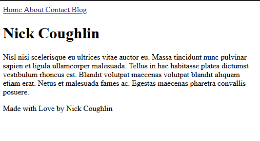
<h1>Nick Coughlin</h1>
<h2>
Nisl nisi scelerisque eu ultrices vitae auctor eu. Massa tincidunt nunc
pulvinar sapien et ligula ullamcorper malesuada. Tellus in hac habitasse
platea dictumst vestibulum rhoncus est. Blandit volutpat maecenas
volutpat blandit aliquam etiam erat. Netus et malesuada fames ac.
Egestas maecenas pharetra convallis posuere.
</h2>
</div>
)
}
export default IndexPage
index.js
Like in many applications, the index.js is the homepage. Whatever is in this file will load by default.
Additional Pages
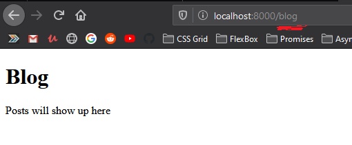
All you need to do is create a page with JSX and export it as a react component and if it is in this folder it will be reachable with a url. The filename dictates the URL where the page can reached. For example blog.js.
import React from "react"

const BlogPage = () => {
  return (
    <div>
      <h1> Blog </h1>
      <p> Posts will show up here </p>
    </div>
  )
}

export default BlogPage
Links
It is possible of course to use standard <a> tags.
import React from "react"

const IndexPage = () => {
  return (
    <div>
      <h1>Nick Coughlin</h1>
      <div>
        <a href="/about">About</a>
      </div>
      <div>
        <a href="/blog">Blog</a>
      </div>
      <div>
        <a href="/contact">Contact</a>
      </div>
    </div>
  )
}

export default IndexPage
And that will work. But Gatsby has it’s own link component that will pre-load all the content available for extra speed.
Gatsby Link
Start by importing the Gatsby link component
import { Link } from 'gatsby'
This is a named component from the Gatsby module. What are the advantages of Gatsby Link? Gatsby will preload all of the content that you can link to on your current page, which means that it will load instantly.
import React from "react";
import { Link } from 'gatsby';

const IndexPage = () => {
  return (
    <div>
      <h1>Nick Coughlin</h1>
      <div>
        <Link to="/about">About Me</Link>
      </div>
      <div>
        <Link to="/contact">Contact Me</Link>
      </div>
      <div>
        <Link to="/blog">My Blog</Link>
      </div>
    </div>
  )
}

export default IndexPage
Note that we pass in a prop to the link component to. This is the equivalent of the href.
Also note that this only works for internal** links. External links must be made in the standard fashion.
Shared Page Components
A shared page component would be something like a navigation bar. Components that will be re-used multiple time on various pages.
There is actually nothing about this that is specific to Gatsby. This is standard React stuff. We make a components directory in the src and put our shared components in there and then reference them in the standard React fashion.
Page Layouts
Here is a scaffold of a page layout component.
import React from 'react';

const Layout = (props) => {
    return (
        <div>
            {props.children}
        </div>
    );
}

export default Layout;
Because we are going to be wrapping the contents of the page with this component we must pass the in the children as props or else nothing inside the component will render.
Then we can go into all our other pages and remove the imports of all other components and import just the layout component. And we can replace all other components in the layout and just wrap the content in this layout that gives us our little navbar and footer.
import React from "react"

import Layout from '../components/layout';

const IndexPage = () => {
  return (
    <Layout>
      <h1>Nick Coughlin</h1>
      <p>
        Nisl nisi scelerisque eu ultrices vitae auctor eu. Massa tincidunt nunc
        pulvinar sapien et ligula ullamcorper malesuada. Tellus in hac habitasse
        platea dictumst vestibulum rhoncus est. Blandit volutpat maecenas
        volutpat blandit aliquam etiam erat. Netus et malesuada fames ac.
        Egestas maecenas pharetra convallis posuere.
      </p>
    </Layout>
  )
}

export default IndexPage
Styling
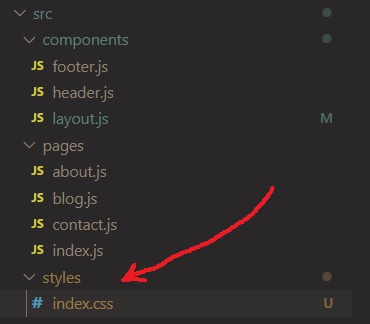
There is not a lot to styling that you don’t already know if you are familiar with React and CSS in general. For the sake of organization we make a new styles directory and we can create a new index.css file there.
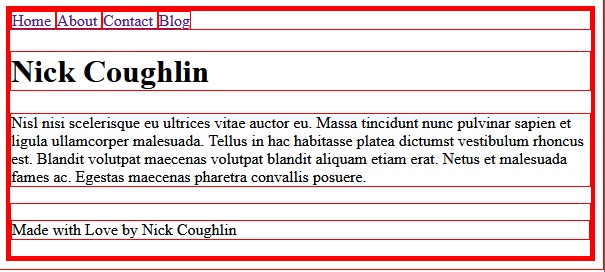
Give it the old red border around everything trick.
* {
    border: 1px solid red;
}
And then you have to import that stylesheet like you have to import everything you use in React. However instead of importing it into every single component we can import it into just the layout component as that is on every page. Your app structure may very but just put it up top unless it is component specific.
import '../styles/index.css';
Gatsby Plugins
Plugins are installed just like any other npm package. A list of plugins is available on the Gatsby website.
gatsby-config
Plugins are configured in the gatsby-config.js file. In this case we importing a plugin that enables the use of SCSS, and all that the config file requires is that make Gatsby aware that we want to use this plugin.
/**
 * Configure your Gatsby site with this file.
 *
 * See: https://www.gatsbyjs.org/docs/gatsby-config/
 */

module.exports = {
  /* Your site config here */
  plugins: [
    'gatsby-plugin-sass'
  ],
}
CSS Modules
One of the very common or even recommended ways to style a Gatsby application is with CSS modules. One of the things about importing CSS style sheets into ANY component is that those styles will apply to the whole page, even if they are just loaded in one component. We could of course get around this by using CSS classes. But modules are sort of the “Gatsby Way”.
Modules make all of the class selectors in a component locally scoped.
Let us create a SCSS module file.
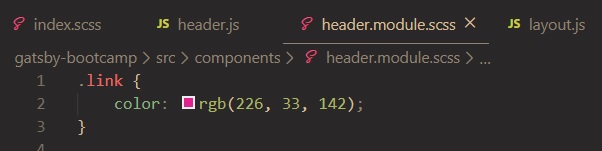
and then we can import that in our header, but note that it is not imported anonymously.
import headerStyles from './header.module.scss';
and then we can reference the .link classname in our header component
const Header = () => {
    return (
        <div>
            <Link to="/" className={headerStyles.link}>Home </Link>
            <Link to="/about"> About </Link>
            <Link to="/contact"> Contact </Link>
            <Link to="/blog"> Blog </Link>
        </div>
    );
}

So why do we take the time to do this? One of the benefits is that these styles are very specific so they won’t be overwritten. Another is that organizationally we styling each module in the module.
Active Nav Item
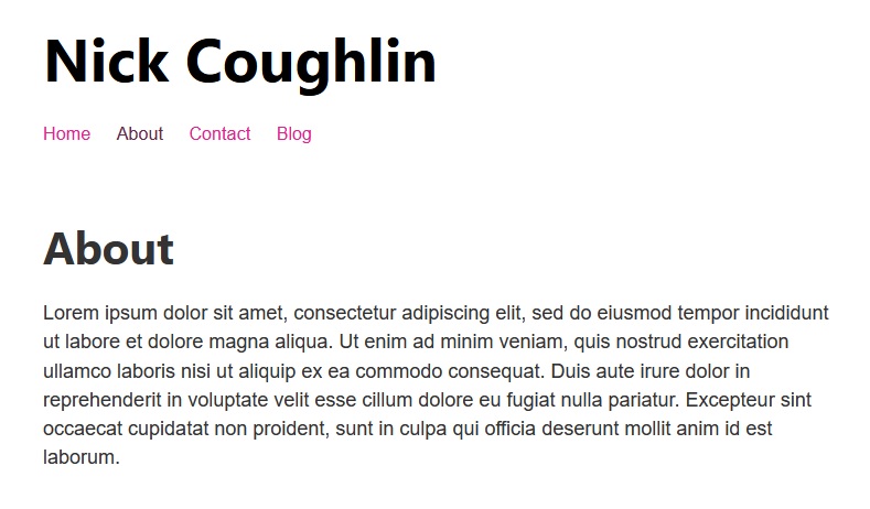
And another example of CSS modules in combination with React-Router to highlight the currently selected page. Here is our header.module.css file.
.header {
    padding: 1rem 0 3rem;
}

.title {
    color: black;
    font-Size: 3rem;
    text-decoration: none;
}

.navList {
    display: flex;
    list-style-type: none;
    margin: 0;
}

.nav-item {
    color: rgb(226, 33, 142);
    font-size: .9rem;
    margin-right: 1.3rem;
    text-decoration: none;
}

.nav-item:hover {
    color: gray;
}

.active-nav-item {
    color: rgb(100, 41, 75);
}
and here is our header component
import React from "react"
import { Link } from "gatsby"

import headerStyles from "./header.module.scss"

const Header = () => {
  return (
    <header className={headerStyles.header}>
      <h1>
        <Link to="/" className={headerStyles.title}>
          Nick Coughlin
        </Link>
      </h1>
      <nav>
        <ul className={headerStyles.navList} >
          <li>
            <Link to="/" className={headerStyles.navItem} activeClassName={headerStyles.activeNavItem}>
              Home
            </Link>
          </li>
          <li>
            <Link to="/about" className={headerStyles.navItem} activeClassName={headerStyles.activeNavItem}>
              About
            </Link>
          </li>
          <li>
            <Link to="/contact" className={headerStyles.navItem} activeClassName={headerStyles.activeNavItem}>
              Contact
            </Link>
          </li>
          <li>
            <Link to="/blog" className={headerStyles.navItem} activeClassName={headerStyles.activeNavItem}>
              Blog
            </Link>
          </li>
        </ul>
      </nav>
    </header>
  )
}

export default Header
That’s all for this post. Next time we are going to be introducing Gatsby Data with GraphQL.
GitHub Repo
Automated Amazon Reports
Automatically download Amazon Seller and Advertising reports to a private database. View beautiful, on demand, exportable performance reports.