Designing This Website
Intro
I've gotten several emails from people saying that they like the style of this website, and asking me about my design process. To make it easier to respond to these requests I'm going to overview my design process here.
Although previous iterations of my blog were all running Wordpress, the current site is a custom rolled Gatsby/React site. Therefore not everything here will necessarily translate to you if you are working with Wordpress or another framework. Just bear that in mind. 🐻
Performance
Let me get some bragging out of the way, here is my current lighthouse report for desktop homepage
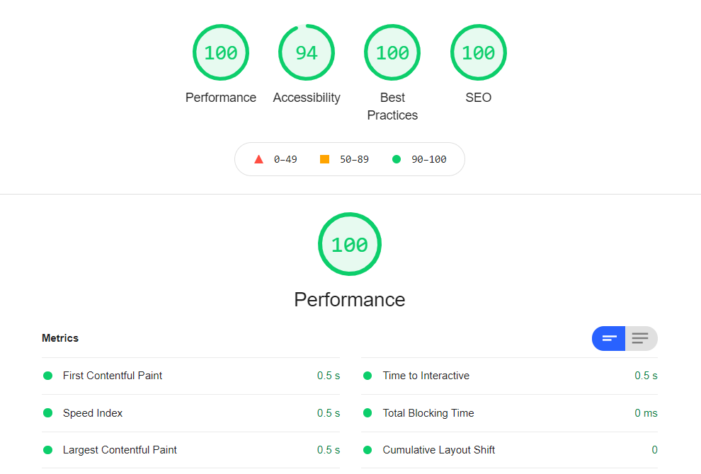
and mobile is at 94. My goal was to make a website that was fast and beautiful, and I think i've done that. But if you are wondering why I don't want to use external libraries or frameworks, this is the answer. Accessability could use some work however. The job is never done.
General Philosophy
In my experience developer blogs tend to fall in to two different categories. You get your front-end developers who like to integrate lot's of fancy CSS, animations, transitions etc. This makes sense for front-end people because they are trying to advertise their skills. However in my opinion it can all be a bit much, and distracting from the content of the site. Front-end polish that would convey professionalism on a product website (when used tastefully) can be distracting on a content blog.
On the other end of the spectrum you have your backend developers who take it to the opposite extreme. To them it's a point of pride to have a site that is pure HTML, minimal CSS and definitely no javascript libraries or frameworks. The website looks like it was made in the 90's using notepad as an IDE, and they like it that way. To them flashy design is a distraction, and a lack of purposeful design indicates that you are part of the programming elite who is above such lowly concerns.
My view is that the middle road is best. I had a list of features that I needed on my site, because I use this site to organize notes for myself, it needed to work for me. My bare minimum features included
- Categories
- Tags
- Live Search
- Auto Generated Table of Contents for all articles
- About/Contact Info Page
- Dark/Light Mode
- Code Syntax Highlighting (it's a coding blog)
So the goal is to make all of those features easy to find and use, without crowding the page, distracting from the content. I had all those features on my old Wordpress site, so I didn't want to take a step backwards in terms of functionality. In addition I had some technical goals
- Extreme speed (Lighthouse score 95+)
- No CSS Frameworks (Bootstrap etc) just pure custom CSS
- Minimum quantity of 3rd party libraries possible
Style Guide
Typically on a project like this you would be working with a Style Guide, which would be provided to you by your clients Marketing department. The Style Guide is designed to clearly define the brand colors, logo usage, fonts etc. This is great because it eliminates a lot of the design choices that a developer would be forced to make on their own. If i'm working on a branding project for a client the Style Guide is often the final deliverable, and a lot of time and effort goes into them. So if you are making a site for a client, ask them if they have a Style Guide!
In this case i'm both the designer and the client so a formal document like this is not necessary, but it can be helpful to make one for yourself if you are having trouble keeping a consistent look throughout your project. There are hundreds of style guides available for browsing on the internet if you need an example of how to create one, just search "style guide examples".
Wireframing
Wireframing is the process of laying out the basic design of your pages using graphics software, before any code gets written. It makes it easier to iterate over design changes, because it's much faster to drag and drop design elements than it is to re-code a CSS theme. There is a lot of software that is designed specifically for this purpose. Some of the popular wireframing software includes
Personally I have 5000+ hours using Adobe Illustrator so that is what I use to create my wireframes.
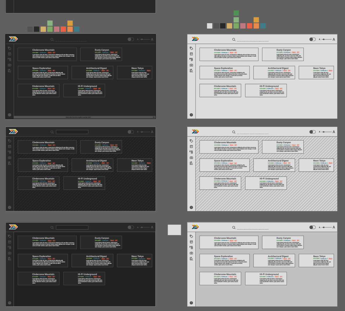
One of the reasons I love to make wireframes in Illustrator is that the artboard system allows me to quickly drag an artboard right next to the previous iteration, make some changes and compare them side by side. My color pallet can exist in blocks right outside the artboards.

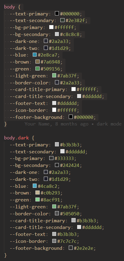
Eventually when I convert the design to code I will use CSS variables for all color references in my stylesheets. That way if I want to change a color, I simply have to update the color value in the variable and it will update across the whole design. Consistency is key!
If you take the time to group all similar elements onto their own layer in illustrator, you can easily select them all at the same time and make changes to them simultaneously.
For example if I grouped all of the article headers onto 1 layer, I can select them all and change their font or weight simultaneously across all the artboards. Using this method I'll often group all similarly colored items and then I can adjust the color pallet across them all until I find a combination that I like.
Article Layout
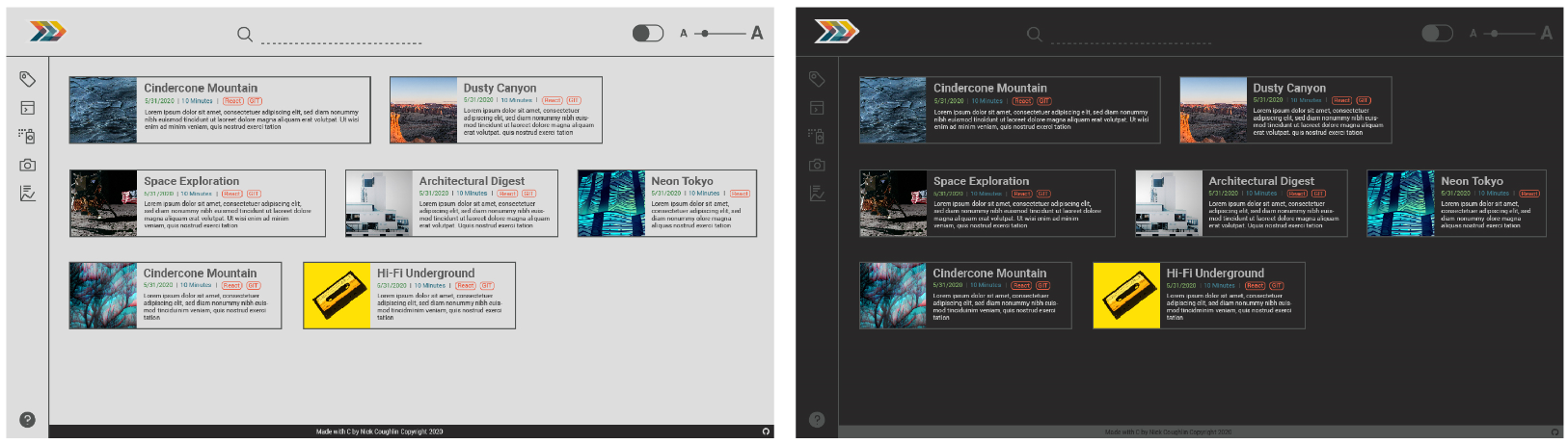
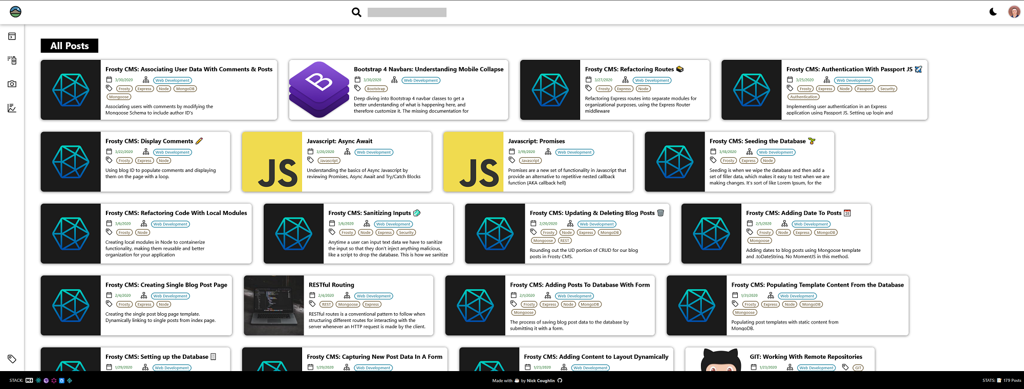
One of the unique features of this blog is the article layout, where articles flow horizontally until they reach the end of the row and then overflow onto the next row. The article thumbnail is situated to the left (instead of the common overhead position on a typical card) and the article title never wraps to the next line. Every article card is variable width instead of variable height, width determined by title length.
If you look at my wireframes you can see that this was an intentional design choice that I've kept from the very beginning. I made this choice for several reasons.
- Because this is not a photography blog, the images are less important than the text. My article thumbnails do not need to be the hero of every card. Instead the most important element is the title.
- Masonry grids, though beautiful, are fitzy. They require either a Javascript Library or if coding by hand measuring image heights and re-drawing the page several times to achieve the desired effect. In a nutshell, not the best for performance.
- This card layout is space efficient. I can fit the most articles on one page this way.
- Natural reading style. The way that we are all trained to read is from left to right in a straight line. This layout allows you to read multiple article titles on one row, before skipping to the next row (which is a consistent height downwards) to read the next set of titles. Standard masonry grids will display titles that are wrapped to multiple lines and then displayed at varying heights. That's a lot of eye jumping.
- This layout is especially well suited for ultra-wide monitors, which is what I use.
- Simple to code. The main content area is simply a flex container with overflow set to wrap. The CSS spec is literally designed to display information this way.
A lot of blog designs get around the masonry issue by creating cards similar to mine, but then only displaying one card (one article) per row. This is ok. But it's just that... ok. My tablet layout follows that pattern. More on that later.
Maybe i'm overthinking this, but that was my process for the article layout. All things considered I think I've made a pretty good case for this layout, and as far as I know it's completely original? Or at the very least uncommon. But I don't think it should be!
Menu, Header & Footer
The overall layout of the navigation is heavily inspired by Visual Studio Code. First, because it's an amazingly clean and utilitarian design, and secondly because it's (primarily) a coding blog, and coders are familiar with this layout. It should be intuitive for the majority of my users.
The sidebar menu is triggered and animated with pure CSS. This is actually something I would consider changing in the future as it is nice to be able to toggle the menu with clicks and have that be managed with React state. It is however very lightweight and responsive, so i'm happy with it for now. If you would like to create a similar menu you can follow this tutorial here.
🎞️ Fireship: Responsive Animated CSS Navbar
One of the nice features of the menu is that it remains visible but replaces the footer on mobile devices. Which brings us into mobile design.
Mobile Design
A lot of people today design their websites mobile first. I think that this should depend on your users. I know from my own analytics over the years that about 95% of my users are on desktop. It's just the nature of my content, people find me at school and at work. Knowing that, I designed my site desktop first. But making new layouts is easy if you understand CSS Grid, Flex and mobile breakpoints. I wanted to have a polished product so I also made a layout for tablet and mobile devices. Here are all three.
↗️ Turn on Dark Mode 🌙 to see easier
Desktop
We've been talking about this already so let's move on to the next part.
Tablet
For the .5% of my users visiting the site on tablet you now get 1 article per row, they stretch full width and the titles would actually wrap now. You also get to keep the thumbnails because i'm assuming that you are still on wifi. However now the menu has moved down to the bottom and is always available. Anyone who uses Google products on mobile will be familiar with this layout.
Mobile
Identical to the tablet layout except i'm taking the thumbnails away. The homepage is already heavy on DOM elements, I don't need a lot of images slowing down the load times on mobile. Images are still present on the articles, and they lazy load so it's not a problem if you have slow data.
If I decide to add more categories later the bottom menu would actually scroll horizontally automatically. The ideal solution however is to keep the content contained to these 5 categories, or redesign this menu to use a modal.
How To Change Layout for Media Breakpoints
Changing layouts for different devices is actually very easy if you understand the basics of Media Breakpoints, CSS Grid and Flex. No matter what dimensions your device is, all of the elements are inside a container, and that container defines a CSS grid. Then each item inside of that grid is assigned a grid-area.
What most people don't realize is that you can simply redefine the grid and it's items location in the grid at every media breakpoint. I could honestly write a whole blog post about this topic but i'm not going to because Rachel Andrew has already written a great example of this.
Gridbyexample.com: Redefining Grid Areas with Media Queries
The point is that if you want to change layouts for different screen sizes, I would say that is the correct way to do it.
Icons
I have some thoughts on icons.
- Unless you are a professional designer, don't try to design your own icons. Making good icons is actually technically very difficult, and if you don't understand it, don't try.
- Get all of your icons from the same set whenever possible. If not possible they should match as closely as possible in terms of style. No mixing monochrome icons from one set with jelly color icons from another set. Consistency!
- Do not modify the size of the icons. Icons are designed to be pixel perfect at specific sizes. Do not modify the icons.
The icons on this website are the IBM UI icons. There are many icon libraries available. Choose wisely.
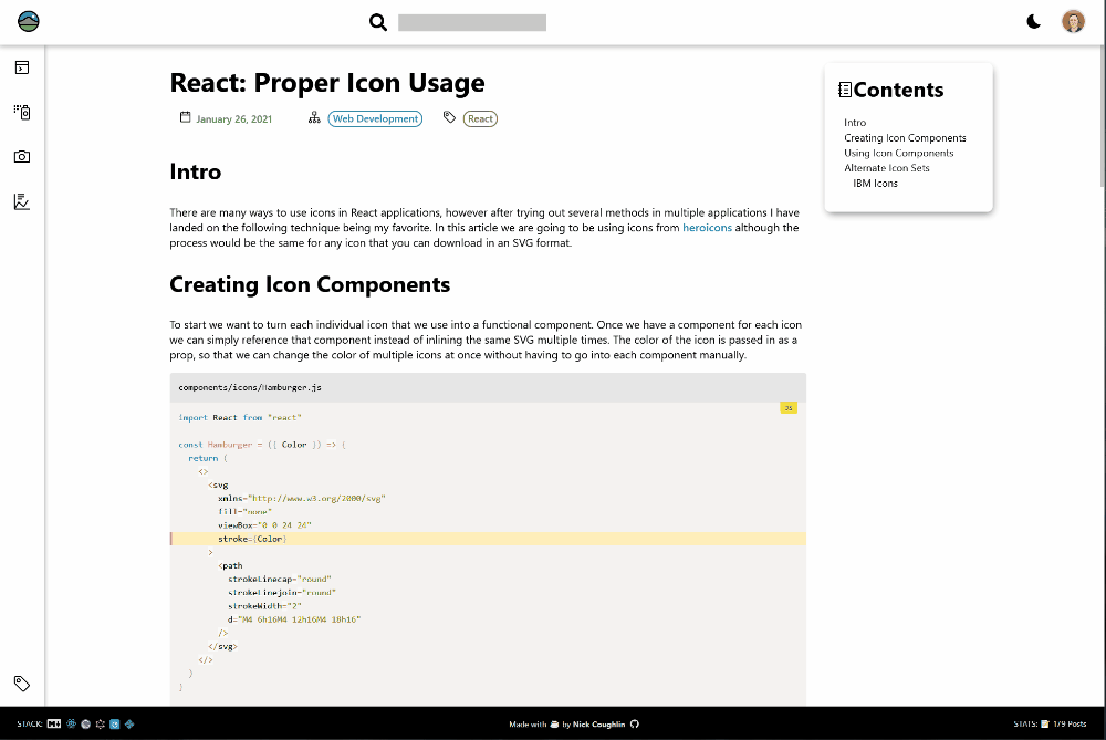
I have written about how to use icons correctly (in my view) in React in this article: React: Proper Icon Usage. Some people disagree with my method, it's not gospel, it's just what I like. I'm not a fan of importing a whole library to use a few icons.
Logo
I've made a lot of logos over the years, and logos are their own topic. But here I'll just say two things.
- Your logo is probably too complicated. Make it simpler.
- Display it with a vector, not a raster image (JPG/PNG)
Table Of Contents
The table of contents is automatically generated using a Gatsby plugin, and I have designed it to show up in a different grid area depending on the width of the screen. The idea is that when you have extra width the TOC shows up on the side, and it will stay visible as you scroll down. Very nice! Then on mobile widths the TOC just sticks to the top of the article.
There is also some custom logic that checks to make sure there are any headings at all. If the TOC is blank it simply does not display.
Future Features
I have some features that I am considering implementing in the future.
- Comments system (Probably Disqus)
- Additional statistics in footer (API call to Google Analytics?)
- State management for menu
- Rework search input to be animated and responsive on mobile (header items overlap on small mobile phones)
If I haven't implemented these things already it's either because
- I'm worried about the impact on performance
- I simply don't have the time right now
Conclusion
I've put more effort into this personal site than most people I think. For me it makes sense because this is my note system. While I am working on projects I will actively come here and find solutions to my problems, links to useful resources, code snippets etc. It's honestly so useful. Web development is one of those subjects that is expansive. Maybe there are some people out there that can learn something and remember it forever. I'm not one of those people.
It also feels good knowing that my content is useful for others. As of writing this I've passed 10,000 users a month and climbing fast. Other developers have helped me so much, it feels good to contribute to the community, even in a small way.
Cheers.
Automated Amazon Reports
Automatically download Amazon Seller and Advertising reports to a private database. View beautiful, on demand, exportable performance reports.