React: Responsive Masonry Image Grid
Series
This is part 3/3 in a series making a responsive masonry image grid in React, with images pulled from Unsplash using an API, queried from a text input in a small sample app.
Part 1: Working With API’s, Mapping Arrays & Looping Images
Part 2: Implementing Keys In Lists
We are working on a small application that requests images from the Unsplash API and displays them in a grid. Now we are at the point where our images are display on the page and we want to organize them into a nice grid.
This would be an easy task if all the images had the same aspect ratio, but we are going to go for one of those fancy tiled grids where the images stack nicely. Unfortunately we won’t be able to accomplish this with vanilla CSS Grid, we will need to implement some JavaScript. Here we go.
CSS Grid
We can start with CSS Grid to get us part of the way there. First let’s take our react component where we are returning the image array object and give it a CSS class so we can style it.
const ImageList = (props) => {

  const images = props.images.map(({id, urls, description}) => {
    return <img key={id} src={urls.small} alt={description} />;
  });

  return <div className="image-list">{images}</div>;
};
And then we can go ahead and lay out a basic CSS Grid groundwork for that.
.image-list {
    display: grid;
    grid-template-columns: repeat(auto-fill, minmax(250px, 1fr));
    grid-gap: 10px;
    grid-auto-rows: 200px;
}

.image-list img {
    width: 250px;
}
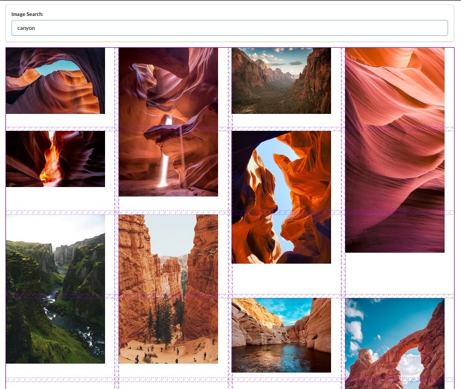
And that gets us to this point here. Our columns and spacing are ok, but we have an issue where the vertical photos are overflowing into the images below them. This is where JavaScript comes in.
Image Card Component
To start, instead of returning an image for each mapped item in the images array, let us make a new component called ImageCard and pass that in instead.
const ImageList = (props) => {

  const images = props.images.map((image) => {
    return <ImageCard key={image.id} image={image} />;
  });

  return <div className="image-list">{images}</div>;
};
And then we can make our new component. Because you always want to the key to be in the top level item for each object, we leave the key as it’s own prop in ImageCard and then we pass in the rest of the data with the image prop. Then we can break the source and alt out again inside of the card.
class ImageCard extends React.Component {
  render() {
    return (
      <div>
        <img
          src={this.props.image.urls.small}
          alt={this.props.image.description}
        />
      </div>
    );
  }
}
At this point the application is functionally the same. However each of these images is now wrapped in it’s own div.
Accessing The DOM With Refs
Here is a breakdown of the process we will be following.
Let the ImageCard render itself and it’s image
Reach into the DOM and figure out the height of the image
Set the image height on state to get the component to rerender
When re-rendering, assign a ‘grid-row-end to make sure the image takes up the appropriate space
So far we have already rendered the ImageCard, now let’s reach into the DOM and figure out the height of the image. If we were using vanilla JavaScript we would do something like document.querySelector('img').clientHeight. However since we are using React we will do something a bit different.
We will be using the react .ref system. Short for reference. React Refs do the following:
Gives access to a single DOM element We create refs in the constructor, assign them to instance variables, then pass to a particular JSX element as props. You can read more about refs here: React Docs: Refs and the DOM
Lets create the ref in the constructor. Inside of our ImageCard component we can add the following constructor and reference the ref as a prop in the image.
class ImageCard extends React.Component {
  constructor(props) {
    super(props);
    this.imageRef = React.createRef();
  }

  render() {
    const { description, urls } = this.props.image;

    return (
      <div>
        <img ref={this.imageRef} src={urls.small} alt={description} />
      </div>
    );
  }
}
From here we can use the componentDidMount() method to console log our reference.
class ImageCard extends React.Component {
  constructor(props) {
    super(props);
    this.imageRef = React.createRef();
  }

  componentDidMount() {
    console.log(this.imageRef);
    console.log(this.imageRef.current.clientHeight);
  }

  render() {
    const { description, urls } = this.props.image;

    return (
      <div>
        <img ref={this.imageRef} src={urls.small} alt={description} />
      </div>
    );
  }
}
But instead of listing the image info and height like we would expect we get the following.

We are getting zero for the image height? What is happening here is that we are pinging the height of the image immediately after the component has mounted, but before the image has actually loaded. We are measuring the height of the image in the DOM before it has actually loaded in the DOM. We can get past this using a callback on image load.
Callback On Image Load
We can handle this using some vanilla JS event listeners. MDN: Event Listeners
class ImageCard extends React.Component {
  constructor(props) {
    super(props);
    this.imageRef = React.createRef();
  }

  componentDidMount() {
    this.imageRef.current.addEventListener("load", this.setSpans);
  }

  setSpans = () => {
    console.log(this.imageRef.current.clientHeight);
  }

  render() {
    const { description, urls } = this.props.image;

    return (
      <div>
        <img ref={this.imageRef} src={urls.small} alt={description} />
      </div>
    );
  }
}
In this instance we have named our callback function on the event listener setSpans because we are going to be using the image height to set the height of our image spans. So hold tight for a minute and that will make sense.
So in a nutshell here, we have made a reference to each image in the DOM, when the component has mounted we use that reference to add an event listener to the image. The event listener watches for the image to load and then has a callback function once that has happened that is console logging the image height.
Dynamic Grid Row Spans
This is the part where we dynamically set the number of Rows that each image spans in the grid.
class ImageCard extends React.Component {
  constructor(props) {
    super(props);
    this.state = {spans:0};
    this.imageRef = React.createRef();
  }

  componentDidMount() {
    this.imageRef.current.addEventListener("load", this.setSpans);
  }

  setSpans = () => {
    const height = this.imageRef.current.clientHeight;
    const spans = Math.ceil(height / 200);
    this.setState({ spans: spans});
  }

  render() {
    const { description, urls } = this.props.image;

    return (
      <div style={{ gridRowEnd: `span ${this.state.spans}` }}>
        <img ref={this.imageRef} src={urls.small} alt={description} />
      </div>
    );
  }
}
We can see in our setSpans function we’ve set a variable for the height. We then calculate the number of spans that each image should make by dividing the height by 200 (which is the hardwired row height) and we then set the state of spans to be that number.
Then we add an inline style down in the render method that tells each div how many rows to span.
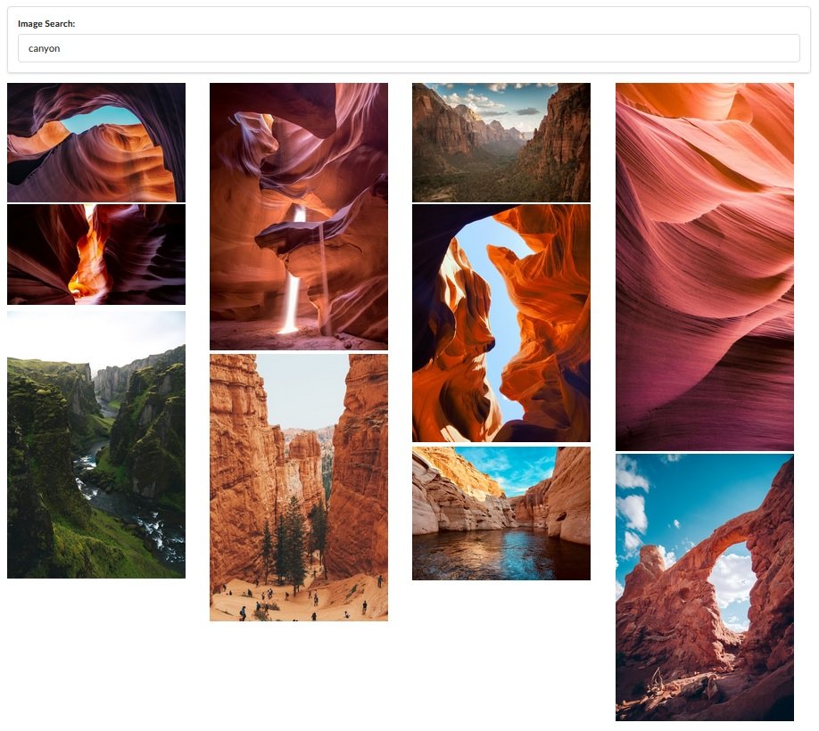
And we can see that we are getting closer, we no longer have image overlap, but we do have a lot of large gaps. The problem here is that each of our row heights is really big… 200px. That does not leave a lot of room for granularity. However what we can do is just make each of the rows much smaller, and then we will have much more fine control. So here is our CSS file.
.image-list {
    display: grid;
    grid-template-columns: repeat(auto-fill, minmax(250px, 1fr));
    grid-gap: 0 10px;
    grid-auto-rows: 10px;
}

.image-list img {
    width: 250px;
}
and our final component
class ImageCard extends React.Component {
  constructor(props) {
    super(props);
    this.state = {spans:0};
    this.imageRef = React.createRef();
  }

  componentDidMount() {
    this.imageRef.current.addEventListener("load", this.setSpans);
  }

  setSpans = () => {
    const height = this.imageRef.current.clientHeight;
    const spans = Math.ceil(height / 10 );
    this.setState({ spans: spans});
  }

  render() {
    const { description, urls } = this.props.image;

    return (
      <div style={{ gridRowEnd: `span ${this.state.spans}` }}>
        <img ref={this.imageRef} src={urls.small} alt={description} />
      </div>
    );
  }
}
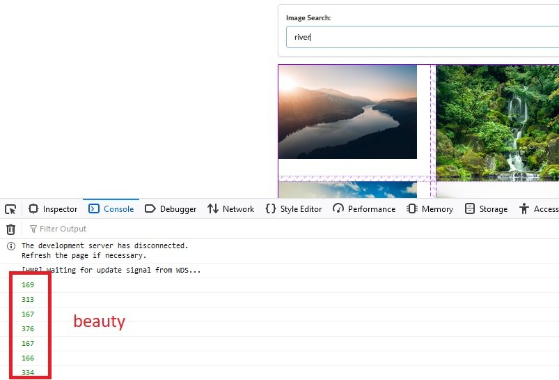
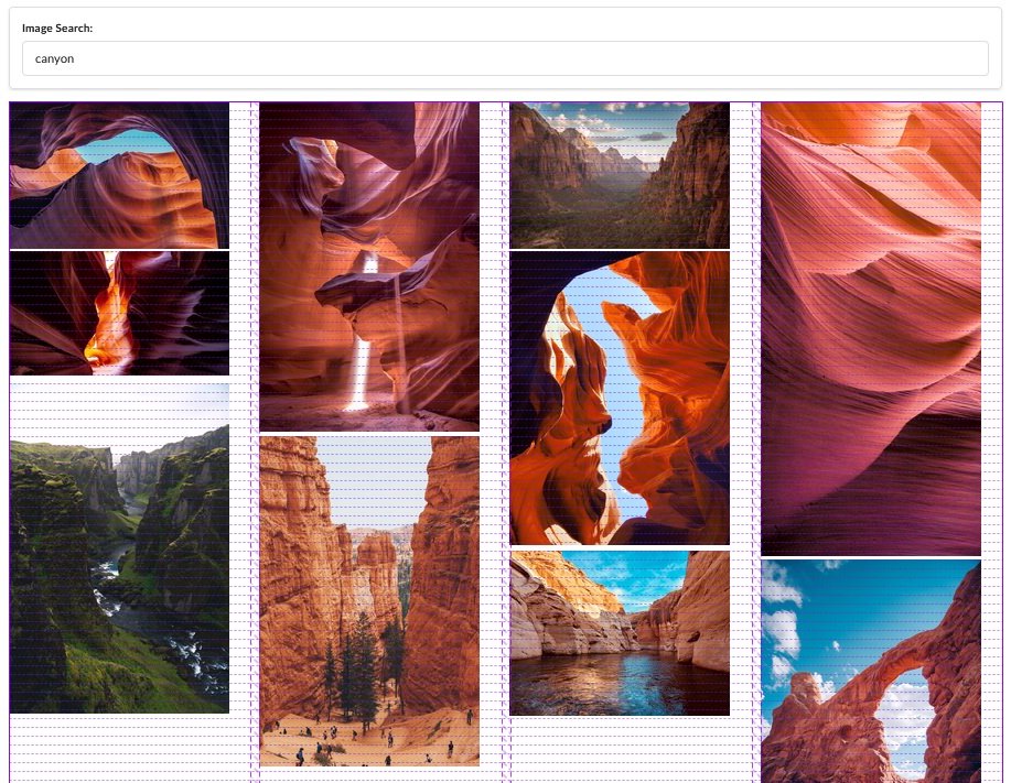
So we have set each of our row heights to 10px, changed span const to reflect that, and we have also updated the grid gap for rows to be 0, because if we have a 10px gap and each row is only 10px height, we end up with double the space necessary. And look at that!
and with the inspector overlay
Comments
Recent Work
Basalt
basalt.softwareFree desktop AI Chat client, designed for developers and businesses. Unlocks advanced model settings only available in the API. Includes quality of life features like custom syntax highlighting.
BidBear
bidbear.ioBidbear is a report automation tool. It downloads Amazon Seller and Advertising reports, daily, to a private database. It then merges and formats the data into beautiful, on demand, exportable performance reports.