Code Snippets
Intro
This is just a collection of useful code snippets that I find myself looking for repeatedly.
CSS
Media Breakpoints
⚠️ When using these breakpoints, comment out or remove any breakpoints that are not actively being used to prevent unexpected behavior.
/* Extra small devices (phones, 640px and down) */
 @media only screen and (max-width: 640px) {}

 /* Small devices (portrait tablets and large phones, 640px and up) */
 @media only screen and (min-width: 640px) {}

 /* Medium devices (landscape tablets, 768px and up) */
 @media only screen and (min-width: 768px) {}

 /* Large devices (laptops/desktops, 1024px and up) */
 @media only screen and (min-width: 1024px) {}

 /* Extra large devices (large laptops and desktops, 1280px and up) */
 @media only screen and (min-width: 1280px) {}
In reality using all of these breakpoints is going to be uncommon, because grid and flexbox make layouts so flexible now. I will typically just create two layouts for each project, with a breakpoint at 1024px, and then possibly fine-tune some individual objects from there. Therefore practically your breakpoint code would look like the following.
/* ************************************** */
/* ----- MEDIA BREAKPOINTS-- ------------ */
/* ************************************** */

/* DEFAULT/MOBILE BEHAVIOR */


/* DESKTOP BEHAVIOR */
/* Large devices (laptops/desktops, 1024px and up) */
@media only screen and (min-width: 1024px) {

}
So that everything is mobile by default, and then the layout changes that need to happen for desktop go in the large devices section. A practical example of that would be shifting the menu for mobile devices. Some basic code for that would go in like this.
/* ************************************** */
/* ----- MEDIA BREAKPOINTS-- ------------ */
/* ************************************** */

/* DEFAULT/MOBILE BEHAVIOR */
/* Hide Desktop Menu until 1024px */
.desktop-menu {
  display: none;
}


/* DESKTOP BEHAVIOR */
/* Large devices (laptops/desktops, 1024px and up) */
@media only screen and (min-width: 1024px) {

/* Hide Mobile Menu Icon on Desktop */
  .mobile-menu-icon {
    display: none;
  }
  .desktop-menu {
    display: flex;
    flex-direction: column;
  }
}
Note that the desktop menu must be explicitly shown with a display property because it was previously hidden.
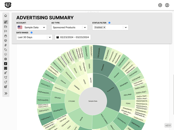
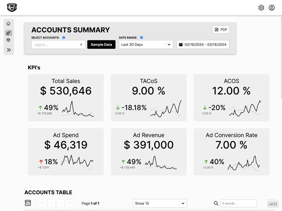
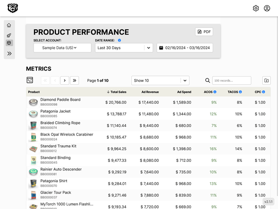
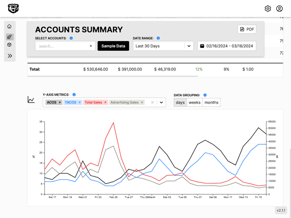
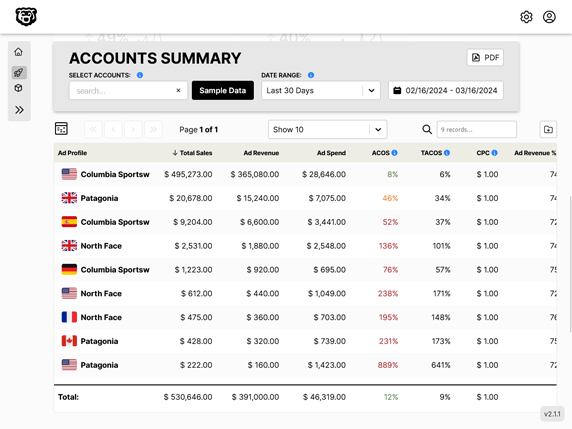
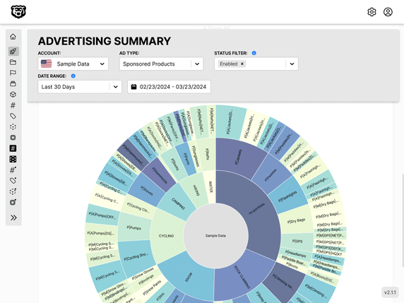
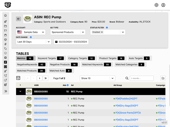
Automated Amazon Reports
Automatically download Amazon Seller and Advertising reports to a private database. View beautiful, on demand, exportable performance reports.