React-Table: useResizeColumns, useBlockLayout
Intro
One of the things we would really like to do with our table is set an explicit width for some of the columns, not based on the data in the columns, but the headers. We want to be able to display our sorting and filtering elements nicely without having the column titles wrap.
It would also be nice for the user to be able to drag the column widths if they want to.
But one of the initial roadblocks that we run into is that the official documentation states that if we useResizeColumns we also need to useBlockLayout OR useAbsoluteLayout.
The trick is that in the code samples using these layout hooks, all of the table elements (tr, td etc...) have been converted to divs. Which leads us to believe that if you want to useBlockLayout you must convert all your elements to divs right?
But is that really the case?
In this (extremely complex) example by David Han he has worked out how to resize the columns with actual table elements...
Medium: Build a powerful table using React Table
So we know that it is possible to keep real table elements and also set explicit column widths and resize them. I've studied David's example, and I think i've cracked it. Here is a working sample.

useBlockLayout
It's easy to understand how this works if we just understand what useBlockLayout actually does. One of the key things that it does is it adds several CSS properties to the rows and columns when they are generated.
display: flexis added to rowsdisplay: inline-blockis added to cells
Yes, we can change the display properties of table elements. I think that this was the main confusion of the person who wrote the official example. They assumed that you could not and so changed all of the elements to divs.
And elements that have a display property of inline-block can have their width explicitly set with width, minWidth, and maxWidth.
The useBlockLayout hook dynamically sets the values of all these widths, based on the defaultColumn object, which can also then be overridden in the columns object for specific rows.
const columns = [
  {
    Header: "First Name",
    accessor: "firstName"
  },
  {
    Header: "Last Name",
    accessor: "lastName",
    maxWidth: 400,
    minWidth: 80,
    width: 300
  },
  // ...
];
useResizeColumns
Now that we understand all that it is much easier to see how the useResizeColumns hook works. We are simply adding a new absolutely positioned div classed "resizer" in each header element on a higher z-index, so that it looks like it is sitting in between the two header elements. When in fact it is inside the one on the left.
Then when we click and drag on that div the width of the column is dynamically changed.
import React from "react";
import { useTable, useBlockLayout, useResizeColumns } from "react-table"; // highlight-line

const DataTable = (props) => {
  // Memos
  const data = React.useMemo(() => props.data, [props.data]);
  const columns = React.useMemo(() => props.columns, [props.columns]);
  const defaultColumn = React.useMemo(
    () => ({
      minWidth: 30,
      width: 150,
      maxWidth: 400
    }),
    []
  );

  // Use the state and functions returned from useTable to build your UI
  const {
    getTableProps,
    getTableBodyProps,
    headerGroups,
    rows,
    prepareRow, // highlight-line
    resetResizing // highlight-line
  } = useTable(
    {
      columns,
      data,
      defaultColumn
    },
    useBlockLayout,
    useResizeColumns
  );

  return (
    <>
      <button onClick={resetResizing}>Reset Resizing</button> // highlight-line
      <table {...getTableProps()}>
        <thead>
          {headerGroups.map((headerGroup) => (
            <tr {...headerGroup.getHeaderGroupProps()}>
              {headerGroup.headers.map((column) => (
                <th {...column.getHeaderProps()}>
                  {column.render("Header")}
                  <div
                    {...column.getResizerProps()}
                    className={`resizer ${
                      column.isResizing ? "isResizing" : ""
                    }`}
                  />
                </th>
              ))}
            </tr>
          ))}
        </thead>
        <tbody {...getTableBodyProps()}>
          {rows.map((row, i) => {
            prepareRow(row);
            return (
              <tr {...row.getRowProps()}>
                {row.cells.map((cell) => {
                  return (
                    <td {...cell.getCellProps()}>{cell.render("Cell")}</td>
                  );
                })}
              </tr>
            );
          })}
        </tbody>
      </table>
    </>
  );
};

export default DataTable;
and the CSS for the resizer div is also important here
table {
  border-collapse: collapse;
  margin: 2rem;
}

th,
td {
  border: 1px solid black;
  padding: 0.5rem 1rem 0.5rem 1rem;
}
.resizer {
  display: inline-block;
  background: blue;
  width: 10px;
  height: 100%;
  position: absolute;
  right: 0;
  top: 0;
  transform: translateX(50%);
  z-index: 1;
  /* prevent scroll on touch devices */
  touch-action: none;
}

.isResizing {
  background: red;
}
Prevent Event Bubbling
One of the errors with the resizer div is that it doesn't prevent event bubbling. So for example if we are also implementing column sorting, every time you click on the resizer div it also counts as a click on the column header, which then triggers a sort event. We can prevent this with one line of code.
In the render section inside our table header we can simply add the event method .stopPropagation().
<div
  {...column.getResizerProps()}
  className={`resizer ${
    column.isResizing ? "isResizing" : ""
  }`}
  onClick={(event)=> event.stopPropagation()} // highlight-line
/>
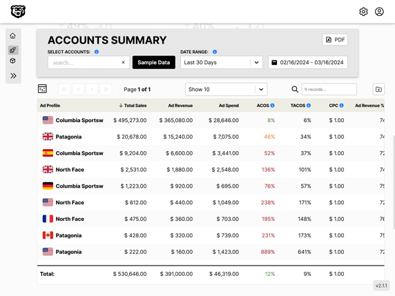
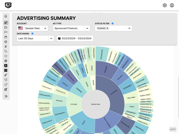
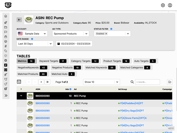
Automated Amazon Reports
Automatically download Amazon Seller and Advertising reports to a private database. View beautiful, on demand, exportable performance reports.