React-Table: Customization
Format Data
There are times when it will be useful to format your data for display. For example if the data in one column is supposed to be dollars, but the data coming in is just numbers. We could write a simple formatting function like this.
const formatMoney = (value) => {
  if (value) {
    return `$${value.toFixed(2)}`;
  } else {
    return "-";
  }
};
This will give us a dollar sign in front of the value, and enforce two decimal places. If it's null we want to display a dash. Great.
To apply this formatting to a specific column we ad the following to our column options.
[
    {
    Header: "Campaign",
    accessor: "campaignname",
    width: 300, // flex-basis
    },
    {
    Header: "Cost",
    accessor: "cost",
    Cell: ({ value }) => formatMoney(value), // highlight-line
    width: 140, // flex-basis
    align: "right",
    },
    // ...
]
This is also useful for things like percentages.
const formatPercentage = (value) => {
  let formatted;
  if (value) {
    let converted = Math.round(value * 100);
    formatted = converted === 0 ? "-" : `${converted}%`;
  } else {
    formatted = "-";
  }
  return formatted;
};
If you don't want to write your own formatting functions there are libraries.
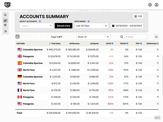
Results

Custom Props
If you are wondering how we got the custom colors in the example above, and also what that "align" property in the column settings is about, you will be interested to learn about custom props.
Custom props let us fine tune our styling for specific columns among other useful things.
To implement custom props is a simple three part process.
- Create functions that combine all props (default and custom) for headers and cells respectively
- Create functions that generate the custom props
- Feed combined prop arrays to
.getHeaderPropsand.getCellPropsrespectively in render
Combine Props Functions
It is useful to break this into two functions, one for headers and one for cells. That way they can be styled separately, and not all props are required for each. For example sorting props are only required in headers.
// required prop format is ARRAY of OBJECTS
  // default props then custom props
  const combinedHeaderProps = (defaultHeaderProps, { column }) => {
    return [
      defaultHeaderProps,
      generateHeaderStyles(column.align),
      column.getSortByToggleProps(),
    ];
  };

  const combinedCellProps = (defaultCellProps, { cell }) => {
    return [
      defaultCellProps,
      generateCellStyles(
        cell.column.align,
        cell.value,
        cell.column.type,
        cell.column.Header
      ),
    ];
  };
The format that react-table requires to combine your props is an array of objects. Therefore looking above at our "generate styles" functions, we can expect that they will return objects. Also note that we are passing in the default props here. If you wanted to completely replace the default props you could by simply not returning them.
Also note that we have destructured the column and cell objects to give us access to the custom column properties that we created such as "align".
Generate Custom Prop Functions
Let's look at a function to generate style props. A couple of things to keep in mind while reviewing this. Note that both functions are returning an object. Also the table in this example is using the useFlexLayout hook. One of the interesting things about that hook is that in the default documentation they make all of the column headers AND the cells flex objects. This is actually not required, because the column headers define the widths of the cells that they govern when you use actual table elements instead of div's (which is another choice I would consider to be an error in the documentation, I wrote more about that here). All that to say in the header styles function we are using the align argument to generate flex alignment styles, and in the cells are are using it to generate text align styles. Thus the usefulness of having a separate function for each.
// adding column option styles to props
const generateHeaderStyles = (align) => {
return {
style: {
justifyContent: align === "right" ? "flex-end" : "flex-start",
alignItems: "flex-start",
display: "flex",
},
};
};
const generateCellStyles = (align, value, type, header) => {
let styleObject = {
color: "currentColor",
// the cells we actually don't want to be flex
textAlign: "",
};
styleObject.textAlign = align === "right" ? "right" : "left";
// color ACOS data
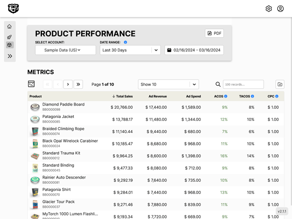
if (header === "ACOS") {
styleObject.color =
value <= 0.2
? "var(--green-dark)"
: value <= 0.4
? "var(--black)"
: value <= 0.5
? "var(--orange-dark)"
: "var(--red-dark)";
}
return {
style: styleObject,
};
};
This is so useful because we can style the cells in each column completely independently. We can target them with a custom property like "align" or we can use a default property like "header".
Feed Props to Render
All that is left to do is feed the array of props we have generated to our render section.
<th
  {...column.getHeaderProps(combinedHeaderProps)} // highlight-line
  className="data-table-header"
>
<td {...cell.getCellProps(combinedCellProps)}> // highlight-line
    {cell.render("Cell")}
</td>
Rows as Links
If you want each row to be a link and you are using React-Router you'll need to take advantage of useHistory
import { useHistory } from "react-router-dom";

// link to campaign page on row click
  const history = useHistory();
  const handleRowClick = (row) => {
    history.push(`/dogs/${row.original.YOUR_IDENTIFIER_FROM_DATASET}`);
  };
and then call this on each row.
<tr onClick={() => handleRowClick(row)} {...row.getRowProps()}>
{row.cells.map((cell) => {
    return (
    <td
        {...cell.getCellProps(combinedCellProps)}
        className="truncate"
    >
        {cell.render("Cell")}
    </td>
    );
})}
</tr>
Style effect like hovering color and pointer are done with CSS. One of the nice things about this also is that when you access the original property of a row, you have access to the full original dataset, not just what is displayed in your columns. So you can use your unique identifier that you didn't actually display in the table.
Automated Amazon Reports
Automatically download Amazon Seller and Advertising reports to a private database. View beautiful, on demand, exportable performance reports.