React: Dropdown Selector w/ useRef Hook
Intro
We are going to build a re-usable dropdown component that gets it's options passed down to it in the form of props.
Scaffolding
First let us create our App and import a dropdown component (yet to be created), and we can define a set of dropdown options in a static array and pass that array into the component as a prop.
import React from "react"

import Dropdown from "./components/Dropdown"

const dropdownOptions = [
  {
    label: "The Color Red",
    value: "red",
  },
  {
    label: "The Color Green",
    value: "green",
  },
  {
    label: "The Color Blue",
    value: "blue",
  },
]

export default () => {
  return (
    <div>
      <Dropdown dropdownOptions={dropdownOptions} />
    </div>
  )
}
and in our dropdown component we will just start with the following blank functional component
import React from "react"

const Dropdown = ({ dropdownOptions }) => {
  return <div>The Dropdown Menu Will Go Here</div>
}

export default Dropdown
which we can then map through the dropdown options
import React from "react"

const Dropdown = ({ dropdownOptions }) => {
  const mappedDropdownOptions = dropdownOptions.map(option => {
    return (
      <div key={option.value} className="item">
        {option.label}
      </div>
    )
  })

  return { mappedDropdownOptions }
}

export default Dropdown
Creating the Dropdown
Because the focus of this article is not on CSS, we are going to be using Semantic UI to create the dropdown styling. Here we can lay out the basics of the dropdown.
import React from "react"

const Dropdown = ({ dropdownOptions }) => {
  const mappedDropdownOptions = dropdownOptions.map(option => {
    return (
      <div key={option.value} className="item">
        {option.label}
      </div>
    )
  })

  return (
    <div className="ui form">
      <div className="field">
        <label className="label">Select a Color</label>
        <div className="ui selection dropdown visible active">
          <i className="dropdown icon"></i>
          <div className="text">Select Color</div>
          <div className="menu visible transition">{mappedDropdownOptions}</div>
        </div>
      </div>
    </div>
  )
}

export default Dropdown
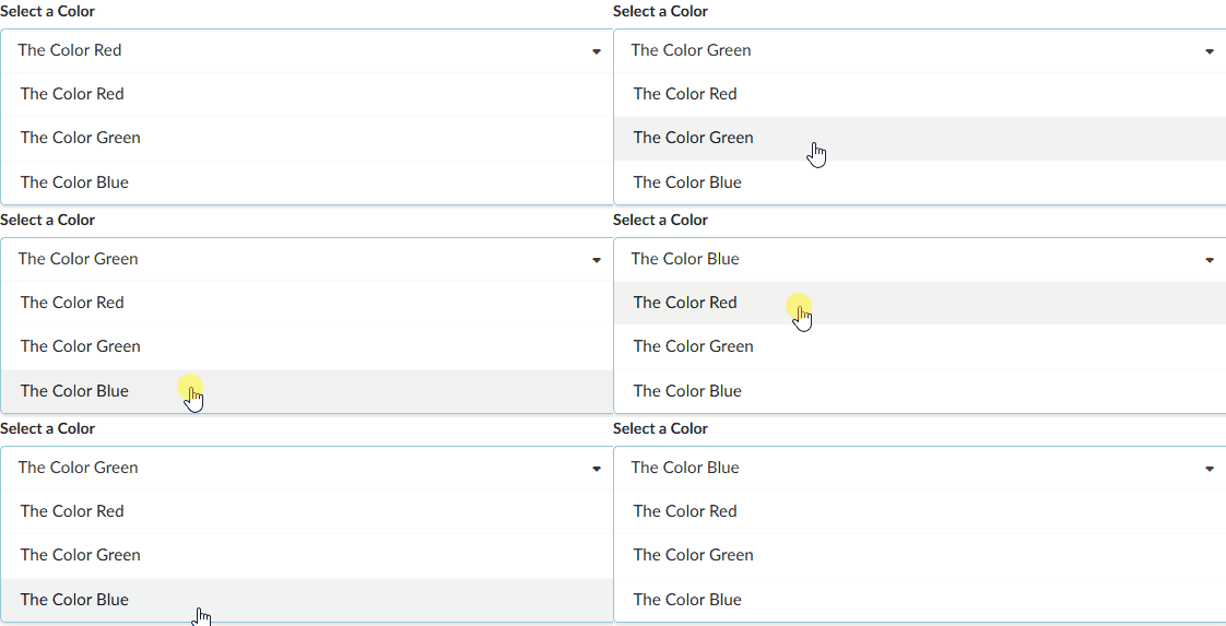
Which will give us the following dropdown with all of the options visible.
Using State To Manage Dropdown Selection
Initializing State
We will be using the useState hook to keep track of state inside of our dropdown widget. First we must initialize the hook in our App, give a name to the state and the state update function (selected & setSelected) and then pass those items into the dropdown as props.
import React, { useState } from "react" // highlight-line

import Dropdown from "./components/Dropdown"

const dropdownOptions = [
  {
    label: "The Color Red",
    value: "red",
  },
  {
    label: "The Color Green",
    value: "green",
  },
  {
    label: "The Color Blue",
    value: "blue",
  },
]

export default () => {
  // state to manage dropdown selection
  const [selected, setSelected] = useState(dropdownOptions[0]) // highlight-line

  return (
    <div>
      <Dropdown
        dropdownOptions={dropdownOptions} // highlight-line
        selected={selected} // highlight-line
        onSelectedChange={setSelected} // highlight-line
      />
    </div>
  )
}
Note that we have passed in the first item of our index [0] as the default prop.
Because setSelected is a function being passed in as a prop, and is therefore a callback, we name that prop with the convention onSomethingChange.
Next we will go into our dropdown component, receive these props and then wire them up to our JSX.
Settings Default Selection
To start we can pass in our default selection as the text.
import React from "react"

const Dropdown = ({ dropdownOptions, selected, onSelectedChange }) => {
  // highlight-line
  const mappedDropdownOptions = dropdownOptions.map(option => {
    return (
      <div key={option.value} className="item">
        {option.label}
      </div>
    )
  })

  return (
    <div className="ui form">
      <div className="field">
        <label className="label">Select a Color</label>
        <div className="ui selection dropdown visible active">
          <i className="dropdown icon"></i>
          <div className="text">{selected.label}</div> // highlight-line
          <div className="menu visible transition">{mappedDropdownOptions}</div>
        </div>
      </div>
    </div>
  )
}

export default Dropdown
Click Event Handler
Next we need to set up a click event handler on each of our dropdown options that will use our callback function to set the state to the option we just clicked.
import React from "react"

const Dropdown = ({ dropdownOptions, selected, onSelectedChange }) => {
  const mappedDropdownOptions = dropdownOptions.map(option => {
    return (
      <div
        key={option.value}
        className="item"
        // on click change selection to current option
        onClick={() => onSelectedChange(option)} // highlight-line
      >
        {option.label}
      </div>
    )
  })

  return (
    <div className="ui form">
      <div className="field">
        <label className="label">Select a Color</label>
        <div className="ui selection dropdown visible active">
          <i className="dropdown icon"></i>
          <div className="text">{selected.label}</div>
          <div className="menu visible transition">{mappedDropdownOptions}</div>
        </div>
      </div>
    </div>
  )
}

export default Dropdown
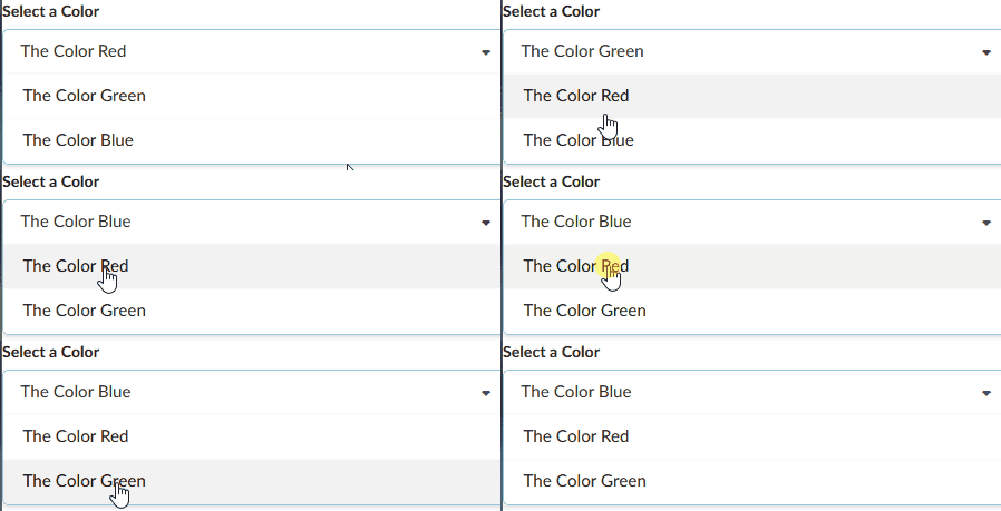
And now when we click on the dropdown items it updates the state of selected which updates the selection shown in the text div.

Filtering The Option List
There are some improvements that we can make to this dropdown. For starters, we don't want the options to be visible until we click on the dropdown. And secondly, we don't want the currently selected option to be visible in the selection AND in the list, so we want to filter the current selection out of the list.
The way we are going to do this, is we are going to intervene when the options are being mapped.
We can create a simple check to see if the selected option is the same as the option that is currently being mapped over. If it is, instead of returning a div as usual, we just return null, effectively skipping this item.
import React from "react"

const Dropdown = ({ dropdownOptions, selected, onSelectedChange }) => {
  const renderedOptions = dropdownOptions.map(option => {
    // if current selection is equal to option do not generate div
    if (option.value === selected.value) {
      return null
    }

    return (
      <div
        key={option.value}
        className="item"
        // on click change selection to current option
        onClick={() => onSelectedChange(option)}
      >
        {option.label}
      </div>
    )
  })

  return (
    <div className="ui form">
      <div className="field">
        <label className="label">Select a Color</label>
        <div className="ui selection dropdown visible active">
          <i className="dropdown icon"></i>
          <div className="text">{selected.label}</div>
          <div className="menu visible transition">{renderedOptions}</div>
        </div>
      </div>
    </div>
  )
}

export default Dropdown

Hiding and Showing the Option List
The way that we toggle the visibility of the dropdown is by toggling the application of a couple of CSS classes. Again, we are using Semantic UI here, so we aren't going to go into writing out these various classes, but simply toggling what classes are applied.
This is going to be the same concept as we have covered here: Ncoughlin: React - Conditional Styling and here Ncoughllin: Gatsby - Conditional Table of Contents except this time we will be using hooks, template literals and ternary operators.
import React, { useState } from "react"

const Dropdown = ({ dropdownOptions, selected, onSelectedChange }) => {
  // state to manage toggle visibility
  const [open, setOpen] = useState(false) // highlight-line

  const renderedOptions = dropdownOptions.map(option => {
    // if current selection is equal to option do not generate div
    if (option.value === selected.value) {
      return null
    }

    return (
      <div
        key={option.value}
        className="item"
        // on click change selection to current option
        onClick={() => onSelectedChange(option)}
      >
        {option.label}
      </div>
    )
  })

  return (
    <div className="ui form">
      <div className="field">
        <label className="label">Select a Color</label>
        <div
          // on click set value of open to opposite of current value
          onClick={() => setOpen(!open)}
          className={`ui selection dropdown ${open ? "visible active" : ""}`}
        >
          <i className="dropdown icon"></i>
          <div className="text">{selected.label}</div>
          <div
            // on click set value of open to opposite of current value
            onClick={() => setOpen(!open)}
            className={`menu ${open ? "visible transition" : ""}`}
          >
            {renderedOptions}
          </div>
        </div>
      </div>
    </div>
  )
}

export default Dropdown
The above syntax can be a bit confusing as we are mixing template literals with ternary operators. Just remember that the ternary operator is saying "if open is true apply this string, else apply this empty string" in the shortest method possible.

Close Dropdown When Clicking Outside of Element
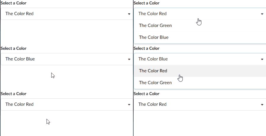
So this all appears to be working correctly, and it is, but we have one major feature this dropdown is missing that most users would expect us to have. Clicking outside of the options does not close the toggle!
This is actually quite complicated to implement inside of React and this is the where the useRef hook finally comes in.
Why This Is Difficult
This is a difficult problem because we essentially need to set up a click event listener OUTSIDE of this component. Setting up event listeners on items inside of the component is easy. But right now the component has no visibility on what is happening outside of its own scope, which is what we are looking at when we want to listen for a click anywhere that isn't inside the component.
Event Bubbling
In order to understand how to solve this problem we first need to become familiar with the concept of event bubbling.
Every time you trigger an event handler, the browser creates a click item which it then sends (bubbles) up through each layer of the DOM, checking each layer along the way to see if it requires any action at that layer. This is an expansive topic, so instead of covering this in depth here please check out Javascript.info: Bubbling and Capturing
Vanilla Event Listeners & useEffect Hook
The solution to this is to combine two previous tools that we have learned. The first was something we learned a long time ago, which is vanilla JavaScript click event listeners. For example here is one that console logs "CLICK" every time the mouse is clicked anywhere in the document body.
document.body.addEventListener("click", someFunction())
and the second is something that we learned more recently, the useEffect() hook.
Ncoughlin: React Hooks useEffect
Just as a brief reminder, the useEffect hook is a way to do something LIKE a component lifecycle, inside of a functional component. We can use this hook to run a function on initial page load, and we can make a vanilla event listener be that function.
import React, { useState, useEffect } from "react"

const Dropdown = ({ dropdownOptions, selected, onSelectedChange }) => {
  // state to manage toggle visibility
  const [open, setOpen] = useState(false)

  // on initial render, add click event listener
  useEffect(() => {
    document.body.addEventListener("click", () => {
      console.log("CLICK")
    })
  }, [])

  const renderedOptions = dropdownOptions.map(option => {
    // if current selection is equal to option do not generate div
    if (option.value === selected.value) {
      return null
    }

    return (
      <div
        key={option.value}
        className="item"
        // on click change selection to current option
        onClick={() => onSelectedChange(option)}
      >
        {option.label}
      </div>
    )
  })

  return (
    <div className="ui form">
      <div className="field">
        <label className="label">Select a Color</label>
        <div
          // on click set value of open to opposite of current value
          onClick={() => setOpen(!open)}
          className={`ui selection dropdown ${open ? "visible active" : ""}`}
        >
          <i className="dropdown icon"></i>
          <div className="text">{selected.label}</div>
          <div
            // on click set value of open to opposite of current value
            onClick={() => setOpen(!open)}
            className={`menu ${open ? "visible transition" : ""}`}
          >
            {renderedOptions}
          </div>
        </div>
      </div>
    </div>
  )
}

export default Dropdown
And now every time the Dropdown component is on the page, there will also be a click listener that will fire anytime ANYTHING is clicked. We could simply change the function inside the event listener to be setOpen(false), but that wouldn't completely solve our problem.
The Order of Event Listeners
Event listeners will be executed in a specific order. First will be all the vanilla Javascript event listeners, and secondly the React event listeners, starting with the most child element and then moving up to the biggest parent. Meaning that of the three click event listeners that we have in the component right now, the vanilla body listener will be called first, then the option selection, then the value.
In this case if we clicked on the value div we would be firing two click event listeners, the top level vanilla listener, which would always turn the value of open to false, and then the listener on the component, which sets it to the opposite of what it currently is.
That makes it so that our dropdown will never close. Every time we click the dropdown expecting the value of open to toggle, we actually toggle it twice and it will stay open.
Event Listener Target
What we really want here is a way to distinguish what item was clicked on. Specifically, if we click on something in the dropdown component, we want the vanilla body event listener to do nothing.
When we use the vanilla addEventListener method we receive back an event that contains information including the target.
useEffect(() => {
  document.body.addEventListener("click", event => {
    console.log(event.target)
  })
}, [])
So how can we know if our target was an item created by the Dropdown component? Here...finally...is where we come to the useRef() hook.
useRef Hook
The useRef hook can be used quite simply to create a reference to a parent element, and if anything inside of that element is referenced with an event listener we can create an action for that.
import React, { useState, useEffect, useRef } from "react"

const Dropdown = ({ dropdownOptions, selected, onSelectedChange }) => {
  // state to manage toggle visibility
  const [open, setOpen] = useState(false)
  // set ref variable
  const ref = useRef() // highlight-line

  // on initial render, add click event listener
  useEffect(() => {
    document.body.addEventListener("click", event => {
      // check if element that was clicked is inside of ref'd component
      // if so no action is required from this event listener so exit
      if (ref.current.contains(event.target)) {
        return
      }
      // else close the dropdown
      setOpen(false)
    })
  }, [])

  const renderedOptions = dropdownOptions.map(option => {
    // if current selection is equal to option do not generate div
    if (option.value === selected.value) {
      return null
    }

    return (
      <div
        key={option.value}
        className="item"
        // on click change selection to current option
        onClick={() => onSelectedChange(option)}
      >
        {option.label}
      </div>
    )
  })

  return (
    // set the reference on the parent element
    <div ref={ref} className="ui form">
      {" "}
      // highlight-line
      <div className="field">
        <label className="label">Select a Color</label>
        <div
          // on click set value of open to opposite of current value
          onClick={() => setOpen(!open)}
          className={`ui selection dropdown ${open ? "visible active" : ""}`}
        >
          <i className="dropdown icon"></i>
          <div className="text">{selected.label}</div>
          <div
            // on click set value of open to opposite of current value
            onClick={() => setOpen(!open)}
            className={`menu ${open ? "visible transition" : ""}`}
          >
            {renderedOptions}
          </div>
        </div>
      </div>
    </div>
  )
}

export default Dropdown
So in plain english, what we have done here is, inside of our vanilla event listener, before we change the state of open to false (close the dropdown) we check to see if the currently referenced item (the dropdown) is the item that triggered the event listener. If it was, we exit the listener having done nothing.
⚠️ React 17 Update: See update at bottom to avoid null ref error.
Avoiding ref.current is null error
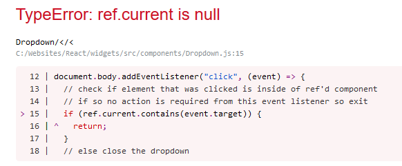
A common error to get when using references is something like "ref.current is null" or "cannot read property of null" referring to the reference. It's common to get this error if the object that is referenced has been removed from the DOM, either with some sort of visibility toggle or React navigation.

The way to fix this is, whenever you are about to remove the referenced item from the DOM, turn off the event listener using a cleanup function.
Review the useEffect hook below. We have changed a couple of things from the previous version. First of all we have broken the click function out into a helper function called onBodyClick to make everything more legible. Then we put that helper function into the callback on the event listener.
So far we have changed nothing functionally.
Lastly we add a new cleanup function to remove the event listener (see highlight).
import React, { useState, useEffect, useRef } from "react"

const Dropdown = ({ label, options, selected, onSelectedChange }) => {
  // state to manage toggle visibility
  const [open, setOpen] = useState(false)
  // set ref variable
  const ref = useRef()

  // close dropdown if clicked anywhere outside of dropdown
  // on initial render, add click event listener
  useEffect(() => {
    const onBodyClick = event => {
      // check if element that was clicked is inside of ref'd component
      // if so no action is required from this event listener so exit
      if (ref.current.contains(event.target)) {
        return
      }
      // else close the dropdown
      setOpen(false)
    }

    // add event listener
    document.body.addEventListener("click", onBodyClick)

    // CLEANUP
    // remove event listener
    return () => {
      document.body.removeEventListener("click", onBodyClick)
    }
  }, [])

  // map options from props
  const renderedOptions = options.map(option => {
    // if current selection is equal to option do not generate div
    if (option.value === selected.value) {
      return null
    }

    return (
      <div
        key={option.value}
        className="item"
        // on click change selection to current option
        onClick={() => onSelectedChange(option)}
      >
        {option.label}
      </div>
    )
  })

  return (
    <div ref={ref} className="ui form">
      <div className="field">
        <label className="label">{label}</label>
        <div
          // on click set value of open to opposite of current value
          onClick={() => setOpen(!open)}
          className={`ui selection dropdown ${open ? "visible active" : ""}`}
        >
          <i className="dropdown icon"></i>
          <div className="text">{selected.label}</div>
          <div
            // on click set value of open to opposite of current value
            onClick={() => setOpen(!open)}
            className={`menu ${open ? "visible transition" : ""}`}
          >
            {renderedOptions}
          </div>
        </div>
      </div>
    </div>
  )
}

export default Dropdown
By removing the event listener with a cleanup function, when the Dropdown component is not shown, the event listener will not fire and try to reference a DOM object that is not there, avoiding the null ref error.
React 17 Update
As of React 17 there is an important change that must be made to the useRef reference. The way it is shown above will cause a null ref error if you click on a React-Router <Link> to navigate somewhere.
if (ref.current.contains(event.target)) {
should be
if (ref.current && ref.current.contains(event.target)) {
This is necessary because of the changes that were made to the way that React handles events. Therefore the full code for the dropdown would look like so.
import React, { useState, useEffect, useRef } from "react"

const Dropdown = ({ label, options, selected, onSelectedChange }) => {
  // state to manage toggle visibility
  const [open, setOpen] = useState(false)
  // set ref variable
  const ref = useRef()

  // close dropdown if clicked anywhere outside of dropdown
  // on initial render, add click event listener
  useEffect(() => {
    const onBodyClick = event => {
      // check if element that was clicked is inside of ref'd component
      // if so no action is required from this event listener so exit
      if (ref.current && ref.current.contains(event.target)) {
        return
      }
      // else close the dropdown
      setOpen(false)
    }

    // add event listener
    document.body.addEventListener("click", onBodyClick)

    // CLEANUP
    // remove event listener
    return () => {
      document.body.removeEventListener("click", onBodyClick)
    }
  }, [])

  // map options from props
  const renderedOptions = options.map(option => {
    // if current selection is equal to option do not generate div
    if (option.value === selected.value) {
      return null
    }

    return (
      <div
        key={option.value}
        className="item"
        // on click change selection to current option
        onClick={() => onSelectedChange(option)}
      >
        {option.label}
      </div>
    )
  })

  return (
    <div ref={ref} className="ui form">
      <div className="field">
        <label className="label">{label}</label>
        <div
          // on click set value of open to opposite of current value
          onClick={() => setOpen(!open)}
          className={`ui selection dropdown ${open ? "visible active" : ""}`}
        >
          <i className="dropdown icon"></i>
          <div className="text">{selected.label}</div>
          <div
            // on click set value of open to opposite of current value
            onClick={() => setOpen(!open)}
            className={`menu ${open ? "visible transition" : ""}`}
          >
            {renderedOptions}
          </div>
        </div>
      </div>
    </div>
  )
}

export default Dropdown
Github Repo
Comments
Recent Work
Basalt
basalt.softwareFree desktop AI Chat client, designed for developers and businesses. Unlocks advanced model settings only available in the API. Includes quality of life features like custom syntax highlighting.
BidBear
bidbear.ioBidbear is a report automation tool. It downloads Amazon Seller and Advertising reports, daily, to a private database. It then merges and formats the data into beautiful, on demand, exportable performance reports.