Design Systems and Components: Making a Decision
Intro
I've been working on an application with a React front-end. Up until this point I've written all of my components and CSS by hand as I go.
This hasn't been an issue until just recently...
We Need A Data Grid
My application is going to require a Data Grid. Which is like a table on steroids. You need to be able to sort the columns, filter and a whole host of other features that standard html tables don't do. They are more akin to spreadsheets than tables. There is no reasonable way for me to build one of these by hand in the time frame available to me. This is when we go library hunting. In addition we need a date range selector. Not just a date selector, a date range selector. Another intimidating component that I don't want to build myself. I just don't have the time.
My search first led me to MUI X. Which is part of the paid MUI component library. And then we have another popular option React Table. These both look great, but now we have fallen down a rabbit hole.
Styled vs Headless
The MUI component framework is built to strictly adhere to the material design design system. Which means it's components are all VERY opinionated in how they look. They can be customized, but within limits. The React-Table component however is headless, meaning that it is designed WITHOUT a style.
There are a lot of implications to these two options. If we go with MUI, we are essentially deciding that our whole application is going to use Material Design (or something very close to it), whereas if we go with React-Table we are free to style as we wish.
I don't like Material Design, so i'm already leaning in the other direction. But now we have a whole host of other questions to answer. Should we be using a component library for most of our other basic components, like menus and dropdowns? So far I have not used any prebuilt components, but i'm beginning to realize that I'm making a big mistake there.
iamerrick: headless user interface components
medium: Headless components in React and why I stopped using a UI library for our design system
The argument for prebuilt components
Because I like to know exactly what is going on under the hood, I tend to write things myself instead of downloading a prebuilt solution. I tell myself that in the end this will save time. However in the case of atomic components like dropdown menus i'm learning that this is not the case. I have created atomic components that are functional at only the most basic level. For example I have not taken into account at all accessability, keyboard controls and screen readers.
Apparently the creators of Radix UI spent over 2,000 hours creating a dropdown. I'll have to admit here that my atomic components won't be as stable as these others built by dedicated teams (begrudgingly). Am I really saving time by not using a collection of prebuilt components? At the very least I am lacking in accessability.
Design Systems vs Component Libraries vs Frameworks
The line between a design system and a component library gets blurry in a lot of places. If the design system at it's core describes how things should look with a set of rules, the component libraries are the collections of prebuilt atomic elements (buttons, toggles) that conform to those rules.
Some design systems have their own component libraries and some don't. Sometimes the component libraries are headless and let you implement your own styles with whatever system you wish.
Sometimes the design system and the component library are so closely intertwined that they appear to be the same thing. A lot of the design systems released by private companies appear to be this way. They created the Design System and components in tandem for their own products and then released a public version, but they have no motivation to separate the concerns here for the general public.
For the sake of getting our thoughts in order let us refer to something like TailwindCSS as a CSS framework. A framework is something we can use to style our headless components. The popular frameworks like Bootstrap and Tailwind also use CSS for things like dropdowns, but if we used those frameworks with a headless react component library we would strip that out and just use the looks.
Could these frameworks not also be considered design systems? They clearly have opinionated designs. For our purposes we will say no. We have to draw the line somewhere for the sake of clarity.
Lastly, we need to distinguish between Static Components, and Interactive Components. Static components are a collection of items designed for looks, for example TailwindUI. Static components do not take into account interactivity and accessibility, handling focus, keyboard controls or ARIA. Those things are all governed by Javascript. In this article when we talk about components we are talking about Interactive Components.
I can write static components myself easily. It's prebuilt Interactive Components that are going to save me time.
At this point we have named all the actors in the play. Design Systems, Component Libraries and CSS frameworks
Design Systems
There are a lot more design systems in the world than I am listing here, but here are a few that interest me.
| Name | Parent |
|---|---|
| Material Design | |
| Base | Uber |
| MongoDB Design System | MongoDB |
| Atlassian Design System | Atlassian |
| Orbit | Kiwi.com |
| Photon | Firefox |
| Thumbprint | Thumbtack |
| Carbon | IBM |
React Component Libraries
I'm only going to include component libraries for React components.
| Name | Data Table | Date Range Picker | Headless | Customizable | Cost |
|---|---|---|---|---|---|
| MUI | Yes | Yes | No | Yes | $186 |
| Base | Yes | Yes | No | Yes | Free |
| Blueprint | Yes | Yes | No | Yes | Free |
| React Suite | Yes | Yes | No | ? | ? |
| Chakra | No | No | No | Yes | $300 |
| react-bootstrap | No | No | No | Yes | Free |
| Ant Design | No | Yes | No | ? | Free |
| headlessUI | No | No | Yes | Yes | Free |
| ReachUI | No | No | Yes | Yes | Free |
| Radix | No | No | Yes | Yes | Free |
| Reakit | No | No | Yes | Yes | Free |
| AriaKit | No | No | Yes | Yes | Free |
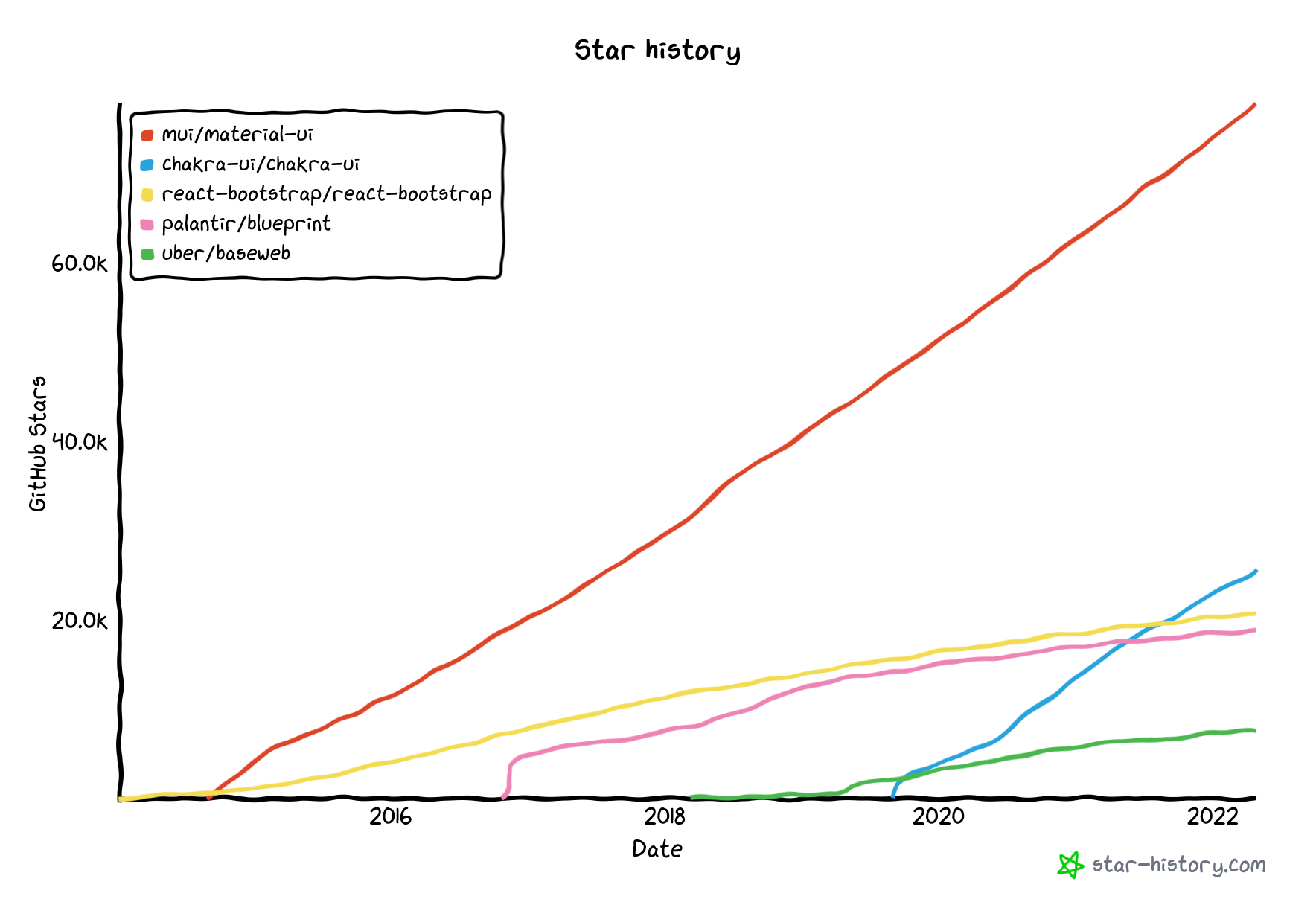
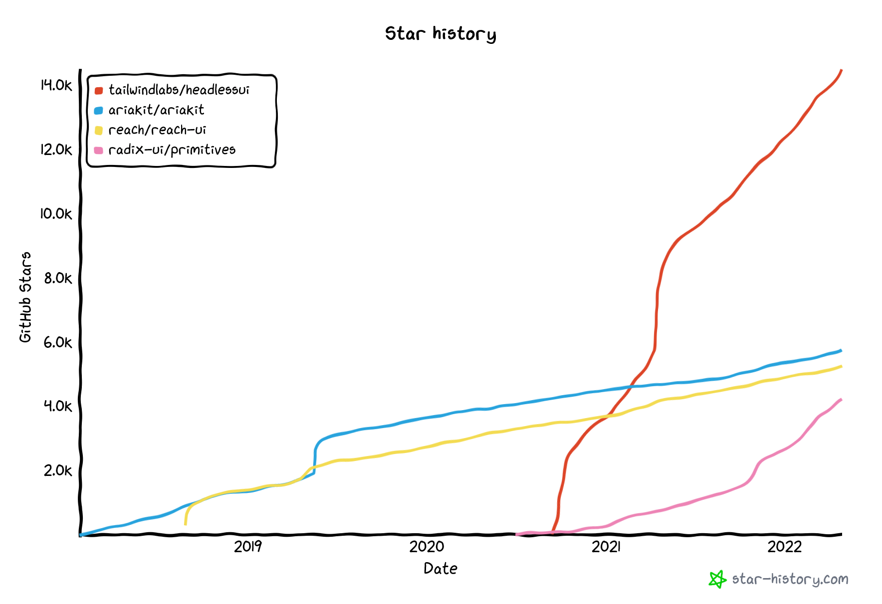
We can see that some of these are headless and some not. Another thing we can check is the trajectory of the github stars to get a sense of their quality and maintainability.
Here are some of the Opinionated libraries
and some of the headless ones
React Individual Components
We can backfill the component libraries that are missing the key components we need with individual components
| Name | Data Table | Date Range Picker | Headless | Customizable | Cost |
|---|---|---|---|---|---|
| react-datepicker | No | Yes | Yes | Yes | Free |
| react-table | Yes | No | Yes | Yes | Free |
CSS Frameworks
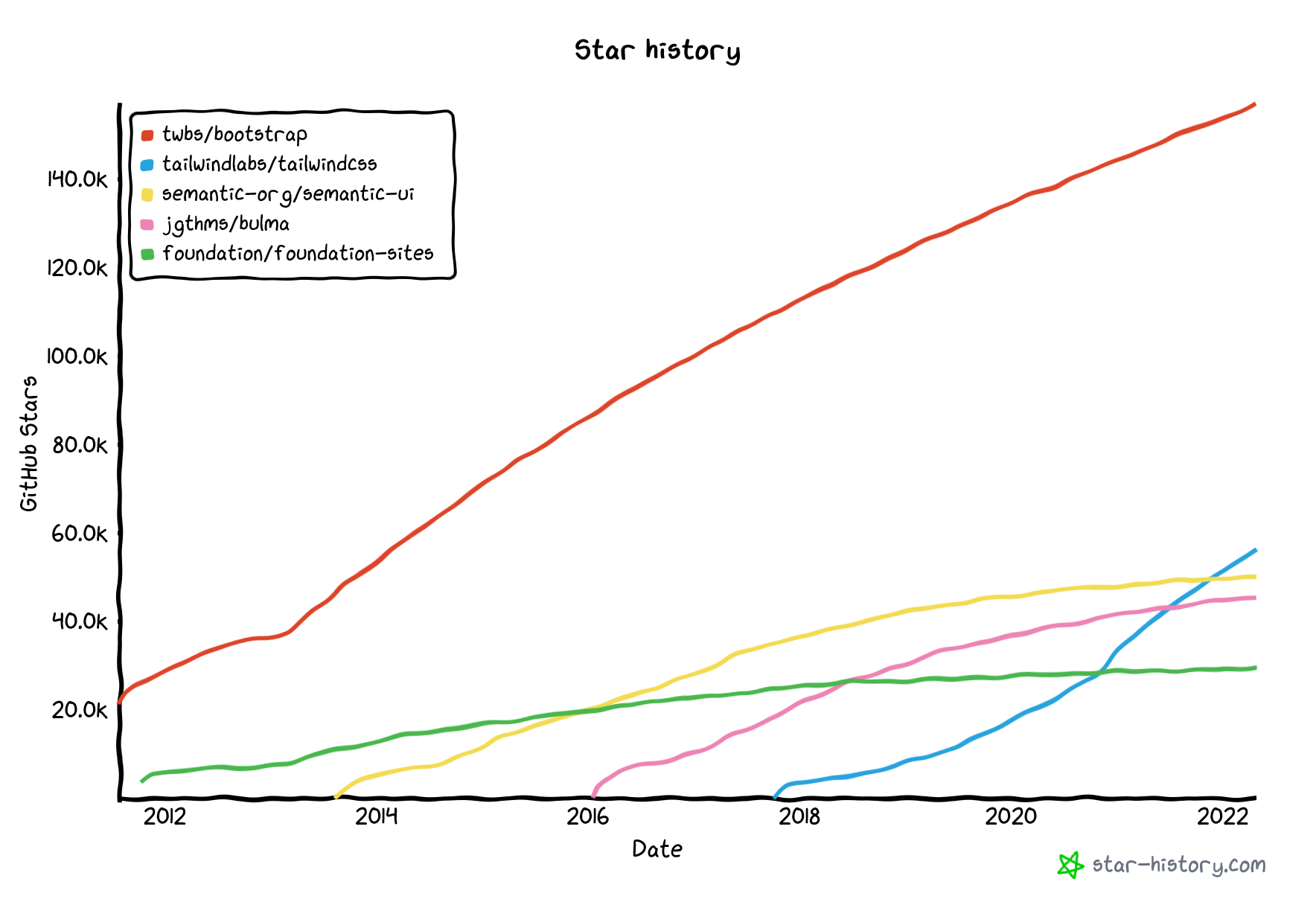
There are many more frameworks than this but here are some of the more popular ones.
| Name |
|---|
| Tailwind UI |
| Bootstrap |
| Foundation |
| Bulma |
| Skeleton |
| SemanticUI |
Needs vs Wants
Now that we have organized our thoughts a bit let's list out the things that we need vs the things that we want, and then we can make some decisions.
Things we need:
- Data Grid
- Date Range Selector
Things we want:
- Headless Components
- A design system or CSS framework so that we can apply consistent styles across our applications
Tailwind Products
Tailwind offers three distinct items. Let's break down what each of these are, and what each of them aren't.
Tailwind CSS
Basically a huge set of CSS utility classes that can be combined to create layouts and style components. It has evolved so that the tailwind package will now get tree shaken on build to remove any unused portions of the package. It also has an IntelliSense extension for VS code so that you can get suggestions on all the available classes. Which was a great addition.
Tailwind UI
This is NOT a collection of accessible interactive components. Let's be very clear about that. At least not in the sense of components as we have been discussing them in this article. There is no Javascript involved with Tailwind UI.
This is simply a collection of prebuilt static visual components using the freely available version of Tailwind CSS. Looks only, no meaningful interactivity.
Tailwind Labs HeadlessUI
A (very small) collection of 10 headless, but fully accessible UI components. They are made to be used with TailwindCSS but could be styled with anything. Like a very early version of Radix.
TailwindCSS Musings
When it comes to something like TailwindCSS my criticism is the same as many others. I don't want all of these utility classes cluttering up my HTML (or in my case JSX) making it impossible to comprehend what I am looking at. And of course you can create components, which helps, but all you are really doing then is just shifting the clutter around.
Where is the clutter?
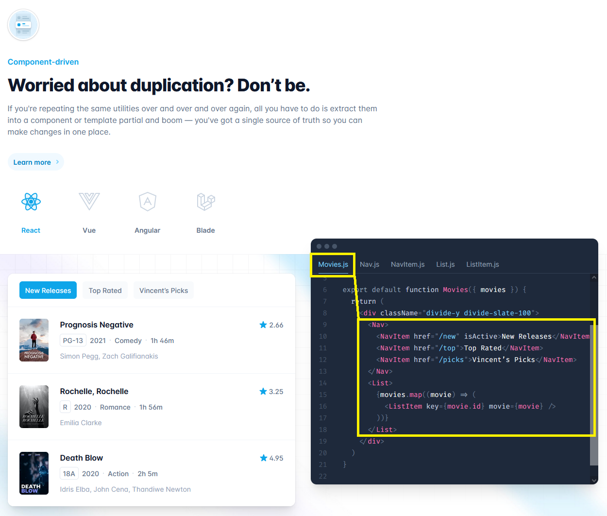
Found it!
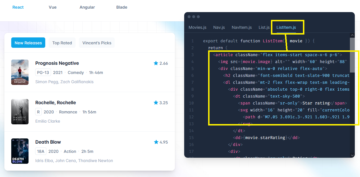
And the biggest sin of all here, is that we are violating the separation of concerns principle. We are mixing our styles with our content. The creator of Tailwind CSS has written a reasonable defense of this:
Adam Wathan: CSS Utility Classes and "Separation of Concerns"
Yet I remain unconverted. The arguments to keep the concerns separate are too strong. You could always use Tailwinds @apply directive as they demonstrate.
.btn {
  @apply text-base font-medium rounded-lg p-3;
}

.btn--primary {
  @apply bg-sky-500 text-white;
}

.btn--secondary {
  @apply bg-slate-100 text-slate-900;
}
If you did that you could build semantic classes by using utility classes. I'm willing to allow a small amount of duplication in my CSS to maintain semantic classes.
Although they say that you should use these directives instead of component frameworks, ideally you would use both.
Enforced Consistency
Of all the arguments that Adam makes in favor of using only utility classes for styling, the enforced consistency argument is the only one that I find truly convincing. There should indeed be consistency in things like colors, font sizes, background colors etc.
However this can also easily be achieved with CSS variables. You can simply make a variables stylesheet with limited options and then anytime a color is referenced you have to select a variable. This also provides the added benefit of being able to test different color schemes across your whole site by simply tweaking the variables. Whereas if you use only utility classes you will need to track down every single color reference and change it to test a site-wide change. This is not a trivial thing.
Conclusions
I'm feeling like I have considered the landscape now and I can come to some conclusions.
If you are creating a quick side project I think that using one of the opinionated component libraries would be the way to go. However if you are building something that you think will still be changing and evolving 5 years from now using headless components is clearly going to incur less tech debt.
Fashion changes constantly, but in 10 years a dropdown menu will still be a dropdown menu. A form will still be a form. For my project I would like to keep my functionality and my styles separate.
I'm going to go with Radix for my headless functional components.
They don't have a data-grid or a date range picker, although I wouldn't really expect them to. I can backfill those components with react-table and react-datepicker.
And with those decisions I can get started.
When it comes to styling I can take a bit of time to decide if I want to use a framework or continue to roll my own. I am intrigued by TailwindCSS because I like the idea of enforced consistency. But if I use it I will probably be using the @apply directive with semantic classnames so that I can keep those utility classes completely out of my components.
TailwindCSS: Extracting classes
Although they do have some solid arguments against that...
TailwindCSS: Avoiding Premature Abstraction
Comments
Recent Work
Basalt
basalt.softwareFree desktop AI Chat client, designed for developers and businesses. Unlocks advanced model settings only available in the API. Includes quality of life features like custom syntax highlighting.
BidBear
bidbear.ioBidbear is a report automation tool. It downloads Amazon Seller and Advertising reports, daily, to a private database. It then merges and formats the data into beautiful, on demand, exportable performance reports.