D3 Scatter Plot Visualization
Intro
We will be learning how to visualize data with D3 while building this scatter plot

Get Data
In this example we are going to be pulling data from a local JSON file. In other applications we would probably be downloading it from an API.
async function draw() {
    const dataset = await d3.json('data.json')
}

draw()
Dimensions
Next we create the dimensions for our chart. It's a good idea to always create dimensions separately with variables as we may need to alter them dynamically.
async function draw() {
  // Data
  const dataset = await d3.json("data.json");

  // Dimensions
  let dimensions = {
    width: 800,
    height: 800,
  };
}

draw();
Draw Image
To draw the image we must start by creating an svg inside our chart div.
<div id="chart"></div>
Create SVG
We select the div, append an SVG element to it, and then set the dimensions with the variables that we created earlier.
async function draw() {
  // Data
  const dataset = await d3.json("data.json");

  // Dimensions
  let dimensions = {
    width: 800,
    height: 800,
  };

  // Draw Image
  const svg = d3
    .select("#chart")
    .append("svg")
    .attr("width", dimensions.width)
    .attr("height", dimensions.height)
}
draw();
Add Margins
Adding margins inside an SVG is not as simple as a standard object. To do so let's create a container inside the SVG. We can't use div's inside svg's, so we need to use an SVG friendly element, like <g> which stands for group.
async function draw() {
  // Data
  const dataset = await d3.json("data.json");

  // Dimensions
  let dimensions = {
    width: 800,
    height: 800,
    margin: {
      top: 50,
      bottom: 50,
      left: 50,
      right: 50,
    },
  };

  // Draw Image
  const svg = d3
    .select("#chart")
    .append("svg")
    .attr("width", dimensions.width)
    .attr("height", dimensions.height)

  // create container
  const container = svg
    .append("g")
    .attr(
      "transform",
      `translate(${dimensions.margin.left}, ${dimensions.margin.top})`
    );

  // quick sample circle
  container.append("circle").attr("r", 25);
}

draw();
We then transform the position of the container with a set of margin variables that we created. Now if we draw a circle which by default would be outside the bounds of the SVG, we can view the whole things, and we don't need to translate the position of all the circles, we can just group them into a container and translate the container.

One small issue is that we have only shifted the container down and to the right, so items could drop off the svg on the bottom and right. We will address this later.
Create Circles
To draw the circles we need to first select our container (which is already set to variable container) and then select all of the circles inside it (which currently there are none).
Then the .data method associates each circle with a piece of data, and each piece of data that doesn't have a circle (which is all of them as there are no circles) gets put into selection.enter.
When we use .join it create a circle for each item in selection.enter. Now there are lots of circles.
async function draw() {
  // Data
  const dataset = await d3.json("data.json");

  // Dimensions
  let dimensions = {
    width: 800,
    height: 800,
    margin: {
      top: 50,
      bottom: 50,
      left: 50,
      right: 50,
    },
  };

  // Draw Image
  const svg = d3
    .select("#chart")
    .append("svg")
    .attr("width", dimensions.width)
    .attr("height", dimensions.height)

  // Create Container
  const container = svg
    .append("g")
    .attr(
      "transform",
      `translate(${dimensions.margin.left}, ${dimensions.margin.top})`
    );

  // Draw Circles
  container
    .selectAll("circle")
    .data(dataset)
    .join("circle")
    .attr("r", 1)
    .attr("cx", (d) => d.currently.humidity)
    .attr("cy", (d) => d.currently.apparentTemperature);
}

draw();
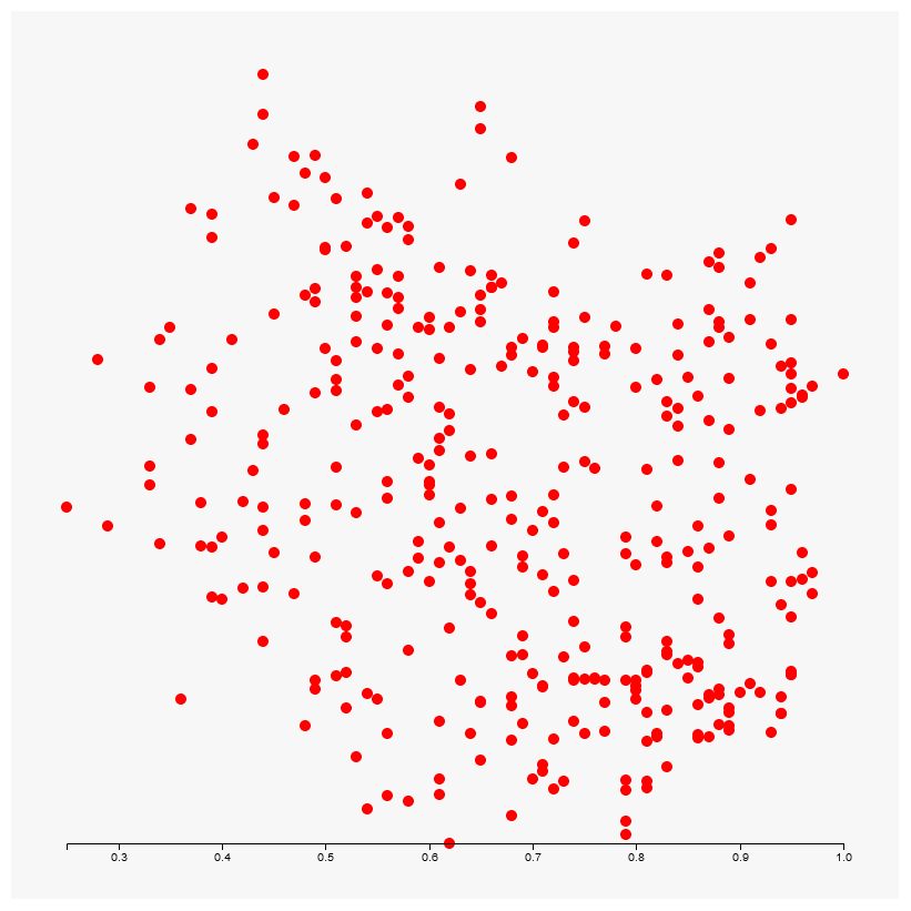
Lastly we need to set some attributes on those circles as they don't have a radius or position. We can give them all a radius of 1 to start and then for position we tie it directly to our data!

We can see that movement on the x-axis isn't even distinguishable. This is because humidity is on a scale of 0-1, and our SVG is 800 pixels wide. We will obviously need to implement some kind of scaling to this.
Accessors
These values for the x,y coordinates of the datapoints are commonly referred to as accessors. They indicate where in the dataset the values are located. Let's go ahead and create variables for these values so they are re-usable, as they will be necessary for many things, like calculating the scale later.
async function draw() {
  // Data
  const dataset = await d3.json("data.json");
  const xAccessor = (d) => d.currently.humidity
  const yAccessor = (d) => d.currently.apparentTemperature

  // Dimensions
  let dimensions = {
    width: 800,
    height: 800,
    margin: {
      top: 50,
      bottom: 50,
      left: 50,
      right: 50,
    },
  };

  // Draw Image
  const svg = d3
    .select("#chart")
    .append("svg")
    .attr("width", dimensions.width)
    .attr("height", dimensions.height)

  // Create Container
  const container = svg
    .append("g")
    .attr(
      "transform",
      `translate(${dimensions.margin.left}, ${dimensions.margin.top})`
    );

  // Draw Circles
  container
    .selectAll("circle")
    .data(dataset)
    .join("circle")
    .attr("r", 5)
    .attr('fill', "red")
    .attr("cx", xAccessor)
    .attr("cy", yAccessor)
}

draw();
Scales
Scales are a convenient abstraction for a fundamental task in visualization: mapping a dimension of abstract data to a visual representation. - D3 docs
There are many variables to take into account when creating the scale of a visualization. Keeping in mind that screen sizes can be constantly shifting the scale could change at any moment. However D3 can do the heavy lifting for us if we provide it with a simple things.
- The input domain
- The output range
The input domain is the domain range of our data. For example if I have a set of values and lowest value is 57 and the highest is 456, the input domain is [57,456].
The output range is simply the available area, such as width or height that is available to us for the viewing area.
D3 has a lot of available pre-made scales. Let's start with a simple linear scale.
const scale = d3.scaleLinear()
  .domain([d3.min(SOME_DATA_RANGE),d3.max(SOME_DATA_RANGE)])
  .range([0,800])
D3 nicely includes a min and max function for us to automatically retrieve our minimum and maximum values. However we could simplify this even further with a function called .extent
const scale = d3.scaleLinear()
  .domain(d3.extent(SOME_DATA_RANGE))
  .range([0,800])
Furthermore we can create some more variables to help us with our range. For example we know that range of our viewport is the width and height minus the margins, like so.
dimensions.containerWidth = dimensions.width - dimensions.margin.left - dimensions.margin.right
dimensions.containerHeight = dimensions.height - dimensions.margin.top - dimensions.margin.bottom
We can use what we have learned here to put together two scales. One for the x-axis, and one for the y-axis.
// Scales
  const xScale = d3.scaleLinear()
    .domain(d3.extent(dataset, xAccessor))
    .range([0, dimensions.containerWidth]);

  const yScale = d3.scaleLinear()
    .domain(d3.extent(dataset, yAccessor))
    .range([0, dimensions.containerHeight]);
We have to include a second argument in the .extent function because our dataset is a nested object, we need to direct it where to look for SOME_DATA_RANGE within that whole dataset. Which we handily had just created variables for earlier.
Now when we create our circles we can put in the coordinates like this:
// Draw Circles
  container
    .selectAll("circle")
    .data(dataset)
    .join("circle")
    .attr("r", 5)
    .attr("fill", "red")
    .attr("cx", d => xScale(xAccessor(d)))
    .attr("cy", d => yScale(yAccessor(d)));
Which altogether looks like this:
async function draw() {
  // Data
  const dataset = await d3.json("data.json");

  const xAccessor = (d) => d.currently.humidity;
  const yAccessor = (d) => d.currently.apparentTemperature;

  // Dimensions
  let dimensions = {
    width: 800,
    height: 800,
    margin: {
      top: 50,
      bottom: 50,
      left: 50,
      right: 50,
    },

  };

  dimensions.containerWidth = dimensions.width - dimensions.margin.left - dimensions.margin.right
  dimensions.containerHeight = dimensions.height - dimensions.margin.top - dimensions.margin.bottom

  // Draw Image
  const svg = d3
    .select("#chart")
    .append("svg")
    .attr("width", dimensions.width)
    .attr("height", dimensions.height);

  // Create Container
  const container = svg
    .append("g")
    .attr(
      "transform",
      `translate(${dimensions.margin.left}, ${dimensions.margin.top})`
    );

  // Scales
  const xScale = d3.scaleLinear()
    .domain(d3.extent(dataset, xAccessor))
    .range([0, dimensions.containerWidth]);

  const yScale = d3.scaleLinear()
    .domain(d3.extent(dataset, yAccessor))
    .range([0, dimensions.containerHeight]);

  // Draw Circles
  container
    .selectAll("circle")
    .data(dataset)
    .join("circle")
    .attr("r", 5)
    .attr("fill", "red")
    .attr("cx", d => xScale(xAccessor(d)))
    .attr("cy", d => yScale(yAccessor(d)));
}

draw();
And finally gives us a real scatterplot.

We are still lacking axis lables and all that, but it's a plot!
Refining Scales
There are many methods available to us to further refine our scales. For example we can round our values with the .nice method. Which we only want to apply to the y-axis due to the nature of the data.
// Scales
  const xScale = d3.scaleLinear()
    .domain(d3.extent(dataset, xAccessor))
    .rangeRound([0, dimensions.containerWidth])
    .clamp(true)

  const yScale = d3.scaleLinear()
    .domain(d3.extent(dataset, yAccessor))
    .rangeRound([0, dimensions.containerHeight])
    .nice()
    .clamp(true)
The rangeRound method round the output of the scales to an integer, which means it is safe to apply to both dimensions and cleans up the data significantly. The clamp method keeps values within the range.
There are many other methods available to us.
Adding an Axis
Axes may seem simple but there is a lot going on. Besides the scale there is the question of ticks, even spacing and quantity of the ticks, as well as labels. Predictably D3 has many methods to assist with this.
Axis Line
To create the x-axis we can simply call the axis function and pass in the appropriate scale.
// Axes
  const xAxis = d3.axisBottom(xScale)

  container
    .append('g')
    .call(xAxis)
Then we reference the container and append a new group to contain our axes and .call the axis.

And we can see that already we have an axis, this has saved us so much effort. However it's not positioned correctly, it's placing itself at the origin of it's parent element. We want to move it to the bottom.
// Axes
  const xAxis = d3.axisBottom(xScale)

  container
    .append('g')
    .call(xAxis)
    .style('transform', `translateY(${dimensions.containerHeight}px)`)
We can append a style to this axis with translateY to move it down a number of pixels equal to the container height.
Axis Label
We can asign a variable to our x-axis group, then we can append a text element to that group and position accordingly.
// Axes
  const xAxis = d3.axisBottom(xScale)

  const xAxisGroup = container
    .append('g')
    .call(xAxis)
    .style('transform', `translateY(${dimensions.containerHeight}px)`)

  // already positioned at bottom
  xAxisGroup.append('text')
    .attr('x', dimensions.containerWidth / 2)
    .attr('y', dimensions.margin.bottom -10)
    .attr('fill', 'black')
    .text('Humidity')
We don't need to move it to the bottom like we did before because it is appended to the xAxisGroup which has already been moved to the bottom.
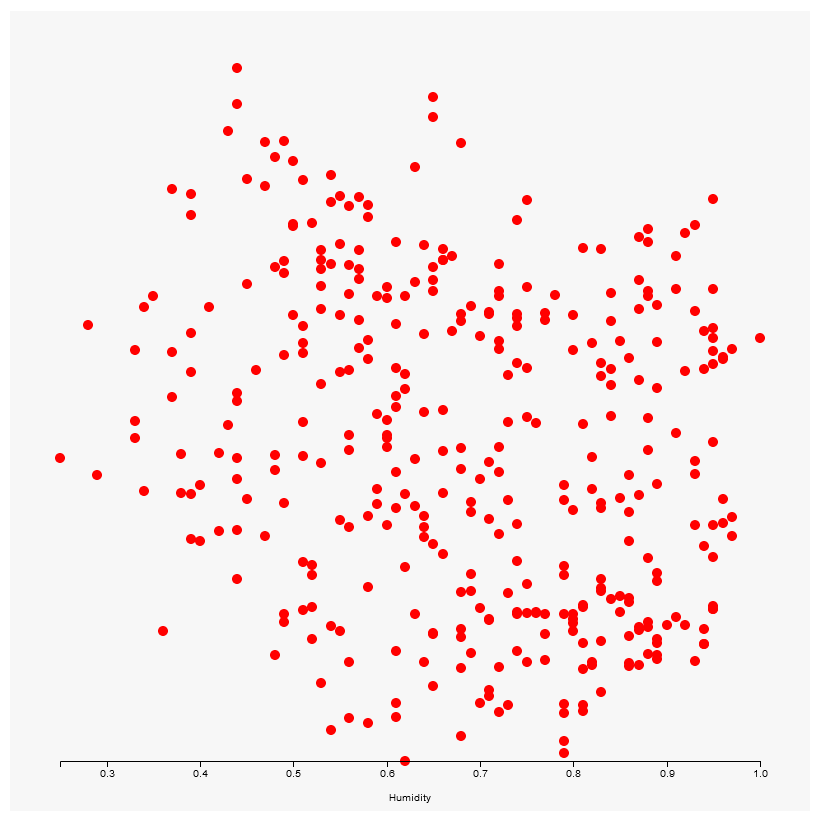
We could add inline styles to make the text on the axis and label bigger, or we could use the .classed method that we learned about earlier to control the font size with CSS.
.axis {
  font-size: 1rem;
}
// Axes
  const xAxis = d3.axisBottom(xScale)

  const xAxisGroup = container
    .append('g')
    .call(xAxis)
    .style('transform', `translateY(${dimensions.containerHeight}px)`)
    .classed('axis', true) // highlight-line

  // already positioned at bottom
  xAxisGroup.append('text')
    .attr('x', dimensions.containerWidth / 2)
    .attr('y', dimensions.margin.bottom -10)
    .attr('fill', 'black')
    .text('Humidity')

Geometric Precision
There is a little known SVG attribute called shape-rendering which can be used to instruct the browser how to render an svg.
This can be especially useful for small text like we would see on an axis.
.axis {
  font-size: .7rem;
  shape-rendering: geometricPrecision;
}
y-axis
We can follow basically the same steps for the y-axis, although the positioning is a bit trickier.
const yAxis = d3.axisLeft(yScale)

const yAxisGroup = container
  .append('g')
  .call(yAxis)
  .classed('axis', true)

yAxisGroup.append('text')
  .attr('x', -dimensions.containerHeight / 2)
  .attr('y', -dimensions.margin.left + 15)
  .attr('fill', 'black')
  .html('Temperature ° F')
  .style('transform', 'rotate(270deg)')
  .style('text-anchor', 'middle')
We also have to use the .html method instead of .text to get the degree symbol to register properly.
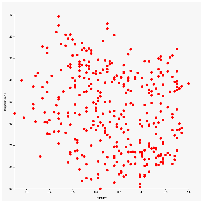
Flipping the y-axis
We are so close, but we can see that our y-axis is flipped, we need to reverse it. Is it possible that all of the y-values of our circles are reversed also?
We can troubleshoot this by adding an attribute to our circles that shows the data.
// Draw Circles
  container
    .append('g')
    .selectAll("circle")
    .data(dataset)
    .join("circle")
    .attr("r", 5)
    .attr("fill", "red")
    .attr("cx", d => xScale(xAccessor(d)))
    .attr("cy", d => yScale(yAccessor(d)))
    .attr('temp', yAccessor)
And then we can inspect the circles on our chart

And we can see that we do in fact have the lowest temperatures towards the top. So we need to inverse all of our y-values. To do this we need to reverse the output range of our yScale. We can do this easily by swapping the values in the range of the yScale from this:
const yScale = d3.scaleLinear()
  .domain(d3.extent(dataset, yAccessor))
  .rangeRound([0, dimensions.containerHeight]) // highlight-line
  .nice()
  .clamp(true)
To this:
const yScale = d3.scaleLinear()
  .domain(d3.extent(dataset, yAccessor))
  .rangeRound([dimensions.containerHeight, 0]) // highlight-line
  .nice()
  .clamp(true)
And we can see that one simple changed updated both our scale and our y-values.

Adjusting Axis Ticks
Let's say we to increase or decrease the frequency of our ticks on the axis, or convert the humidity to a percentage?
.ticks
D3 provides an axis method called .ticks that allows us to manually set the number of ticks.
// Axes
  const xAxis = d3.axisBottom(xScale)
    .ticks(5)
But we can see that D3 is now showing 4 ticks instead of 5...

.tickValues
This is because D3 views our tick request as a suggestion, it always tries to evenly space ticks. What if I REALLY want 5 ticks? We can use the .tickValues method and provide an array with the precise ticks that we would like.
// Axes
  const xAxis = d3.axisBottom(xScale)
    .tickValues([0.4, 0.5, 0.8])

.tickFormat
We can adjust the format of the tick values with the .tickFormat method.
 // Axes
  const xAxis = d3.axisBottom(xScale)
    .tickFormat(d => d * 100 + "%")
Comments
Recent Work
Basalt
basalt.softwareFree desktop AI Chat client, designed for developers and businesses. Unlocks advanced model settings only available in the API. Includes quality of life features like custom syntax highlighting.
BidBear
bidbear.ioBidbear is a report automation tool. It downloads Amazon Seller and Advertising reports, daily, to a private database. It then merges and formats the data into beautiful, on demand, exportable performance reports.