D3 Circular Charts
Intro

We have done a lot of line based charts, but to create circular based charts we need to introduce a couple of new concepts such as arcs, radians and ordinal scales for dynamic color generation. Let's get started with a simple pie chart, and then we can look into exploring the D3 Sunburst Chart.
Arcs
An arc is a portion of a circle. Like a slice of pizza. D3 needs a starting angle and ending angle to draw arcs. The value of the angles are measured in radians.
Radians
The radian, denoted by the symbol rad, is the SI unit for measuring angles, and is the standard unit of angular measure used in many areas of mathematics.
One radian is the distance of the radius of the circle along the perimeter of the circle.
D3 is going to abstract away a lot of this math, but it's useful to understand this.
d3.pie()
The pie method takes an array of data and returns an array of the same length with a start angle and end angle for each Arc, with the angle being given in radians.
It essentially determines how much of the pie each datum takes up.
Here is a sample returned array. We will refer to this array as slices
[
  {"data":  1, "value":  1, "index": 6, "startAngle": 6.050474740247008, "endAngle": 6.166830023713296, "padAngle": 0},
  {"data":  1, "value":  1, "index": 7, "startAngle": 6.166830023713296, "endAngle": 6.283185307179584, "padAngle": 0},
  {"data":  2, "value":  2, "index": 5, "startAngle": 5.817764173314431, "endAngle": 6.050474740247008, "padAngle": 0},
  {"data":  3, "value":  3, "index": 4, "startAngle": 5.468698322915565, "endAngle": 5.817764173314431, "padAngle": 0},
  {"data":  5, "value":  5, "index": 3, "startAngle": 4.886921905584122, "endAngle": 5.468698322915565, "padAngle": 0},
  {"data":  8, "value":  8, "index": 2, "startAngle": 3.956079637853813, "endAngle": 4.886921905584122, "padAngle": 0},
  {"data": 13, "value": 13, "index": 1, "startAngle": 2.443460952792061, "endAngle": 3.956079637853813, "padAngle": 0},
  {"data": 21, "value": 21, "index": 0, "startAngle": 0.000000000000000, "endAngle": 2.443460952792061, "padAngle": 0}
]
The index is the order that the arcs will be drawn.
d3.arc()
The arc method will actually draw our arcs using the data formatted by the pie method.
This method requires that you provide the inner and outer radius. The outer radius you can calculate by taking the width of your container divided by two. The inner radius would be 0 for a pie chart, or another value for a donut type chart.
Knowing this we can start to understand how a sunburst graph could be made by generating multiple pie charts where the inner radius of the outer ring start where the radius of the inner ring ends.
const arc = d3.arc()
    .innerRadius(0)
    .outerRadius(100)
    .startAngle(0)
    .endAngle(Math.PI / 2);

arc(); // "M0,-100A100,100,0,0,1,100,0L0,0Z"
We can see that the output of the arc method is a path value. Now to actually use this we would we would do something like the following
// create and center new group for arcs
const arcGroup = ctr.append('g')
  .attr(
    'transform',
    `translate(${height/2},${width/2})`
  )

// draw arcs
arcGroup.selectAll('path')
  .data(slices) // data transformed with .pie()
  .join('path')
  .attr('d', arc) // set path d property value to output of arc function
remembering that d is one of the properties of a path like so
<path d="M100,100 L300,150" fill="none" stroke="purple" stroke-width="10"></path>
The above arc drawing code will generate a pie chart where all the slices are black. If we want to automatically color our slices we need to learn about ordinal scales.
Ordinal Scales
Can generate colors automatically. It will transform discrete data into discrete data.
// return an array of equally spaced values between 0,1
const colors = d3.quantize((t)=> d3.interpolateSpectral(t), dataset.length)

const colorScale = d3.scaleOrdinal()
  .domain(dataset.map(element => element.name)) // generate new array that is a list of datum names
  .range(colors)
we can then take this color scale and apply it to our arc drawing code
// draw arcs
arcGroup.selectAll('path')
  .data(slices)
  .join('path')
  .attr('d', arc)
  .attr('fill', d => colorScale(d.data.name))
Final Pie Chart
Here is the final pie chart with some additional code to add labels
async function draw() {
  // Data
  const dataset = await d3.csv('data.csv')

  // Dimensions
  let dimensions = {
    width: 600,
    height: 600,
    margins: 10,
  }

  dimensions.ctrWidth = dimensions.width - dimensions.margins * 2
  dimensions.ctrHeight = dimensions.height - dimensions.margins * 2
  const radius = dimensions.ctrWidth / 2

  // Draw Image
  const svg = d3.select('#chart')
    .append("svg")
    .attr("width", dimensions.width)
    .attr("height", dimensions.height)

  const ctr = svg.append("g") // <g>
    .attr(
      "transform",
      `translate(${dimensions.margins}, ${dimensions.margins})`
    )

  // Scales
  const populationPie = d3.pie()
    .value((d) => d.value)
    .sort(null)
  const slices = populationPie(dataset)

  const arc = d3.arc()
    .outerRadius(radius)
    .innerRadius(0)
  const arcLabels = d3.arc()
    .outerRadius(radius)
    .innerRadius(200)

  const colors = d3.quantize(d3.interpolateSpectral, dataset.length)
  const colorScale = d3.scaleOrdinal()
    .domain(dataset.map(element => element.name))
    .range(colors)

  // Draw Shape
  const arcGroup = ctr.append('g')
    .attr(
      'transform',
      `translate(${dimensions.ctrHeight / 2}, ${dimensions.ctrWidth / 2})`
    )

  arcGroup.selectAll('path')
    .data(slices)
    .join('path')
    .attr('d', arc)
    .attr('fill', d => colorScale(d.data.name))

  const labelsGroup = ctr.append('g')
    .attr(
      'transform',
      `translate(${dimensions.ctrHeight / 2}, ${dimensions.ctrWidth / 2})`
    )
    .classed('labels', true)

  labelsGroup.selectAll('text')
    .data(slices)
    .join('text')
    .attr('transform', d => `translate(${arcLabels.centroid(d)})`)
    .call(
      text => text.append('tspan')
        .style('font-weight', 'bold')
        .attr('y', -4)
        .text(d => d.data.name)
    )
    .call(
      text => text.filter((d) => (d.endAngle - d.startAngle) > 0.25)
        .append('tspan')
        .attr('y', 9)
        .attr('x', 0)
        .text(d => d.data.value)
    )
}

draw()
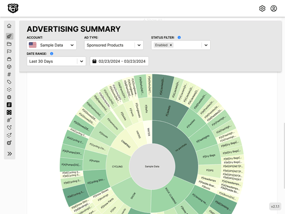
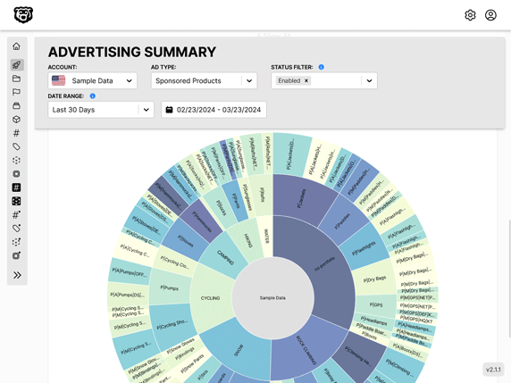
Now that we have learned the basics of circular charts we can start to explore some of the more complicated charts like a sunburst chart.
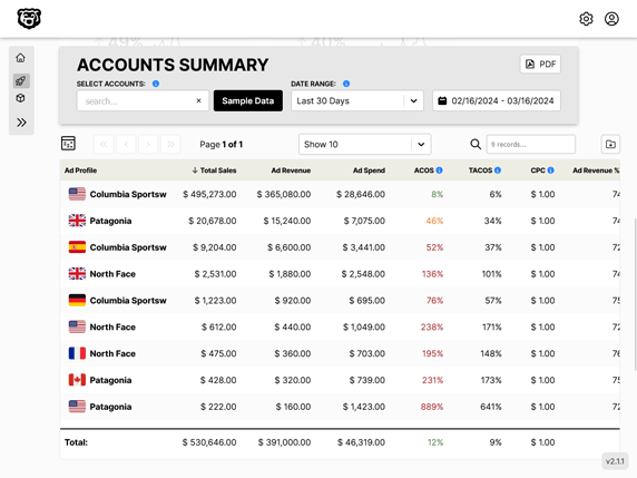
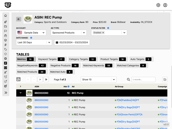
Automated Amazon Reports
Automatically download Amazon Seller and Advertising reports to a private database. View beautiful, on demand, exportable performance reports.