Building A CSS Grid Without display:grid Or display:flex
This is a guide on how to build a simple responsive grid layout without using Flexbox or CSS Grid. AKA: Grids for Nostalgic Masochists.
The basic concept is that you are going to create a container <div> that is going to hold a set of inner <div>s. The basic things to keep in mind are this:
- Inner
<div>s are aligned using float: left; - Regardless of whether container width or max-width is set with a % or hard-coded px: The sum of horizontal width, margin & padding of the inner div‘s MUST equal 100%
Let us take the following example
#squareContainer {
    max-width: 60%;
    margin: 0 auto;

}

.square {
    background: purple;
    width: 30%;
    margin: 1.66%;
    float: left;
    padding-bottom: 30%;
}
And here you have a live editable version to play with.
Let’s break down what is happening here line by line. First the container grid:
max-width: 60% : This is arbitrary. It just the total width of the grid in the page. If you want the grid to cover the whole page then set this to 100%.
margin: 0 auto : This is just a hacky way of centering the whole container grid using margin, as there is no proper alignment property for whole divs (unlike text or content). So the 0 margin on top and bottom is irrelevant, you can set that to what you want. It is the auto horizontal margin that centers the container in the page.
Now the square :
width: 30% :
margin: 1.66% :
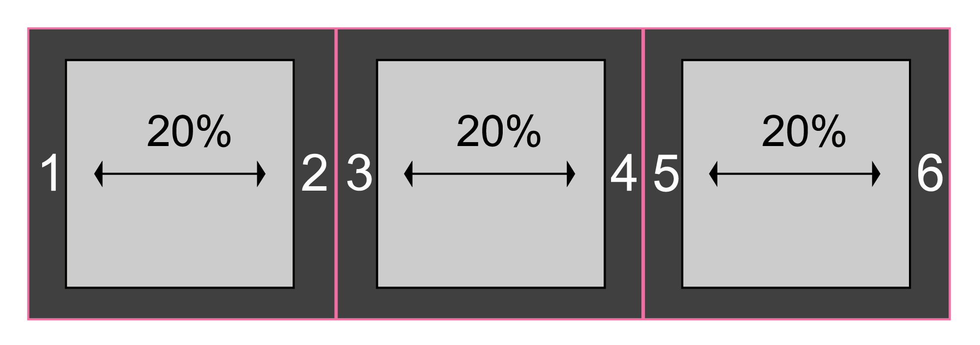
Remember the sum of these items must be equal to 100%. If I want to have 3 squares on each row, I will have 6 horizontal margins (2 on each side). Therefore I need to divide the remainder of my hundred by 6 to set my margin width percentages.

So in this example here I have set my squares to be 20% wide each.
100-60 = 40 That gives me the remaining percentage of horizontal width.
Now I need to divide that by 6, representing my 6 margins as shown above:
40/6 = 6.66
So I must set my margins to 6.66% in this instance. Try it in the codepen above.
If your container div is hard coded with a pixel width, the percentage of the inside squares will be unaffected. The will just resize themselves to fit the container.
Lastly, to touch on the last two properties of the .square class:
float: left; is just getting all the squares to slide up and to the left. Stacking them properly.
padding-bottom: 30%; This is giving the squares a vertical height as a percentage of the width of the container. If you remove this property the height of the elements will be equal to 0, and therefore they will disappear.
You could also set the height of the square with height: however that is relative to the height of the parent element, the container, which in this case does not have a set height. But you could set one if you wanted to. More on height here:
Comments
Recent Work
Basalt
basalt.softwareFree desktop AI Chat client, designed for developers and businesses. Unlocks advanced model settings only available in the API. Includes quality of life features like custom syntax highlighting.
BidBear
bidbear.ioBidbear is a report automation tool. It downloads Amazon Seller and Advertising reports, daily, to a private database. It then merges and formats the data into beautiful, on demand, exportable performance reports.