AWS SageMaker Tutorial: Part 1
Intro
In this tutorial we will be using Sagemaker Studio to build train and deploy a machine learning model that uses a linear regression algorithm.
Additional Resources
Jupyter Notebook: Regression with Amazon SageMaker Linear Learner algorithm
Data in S3
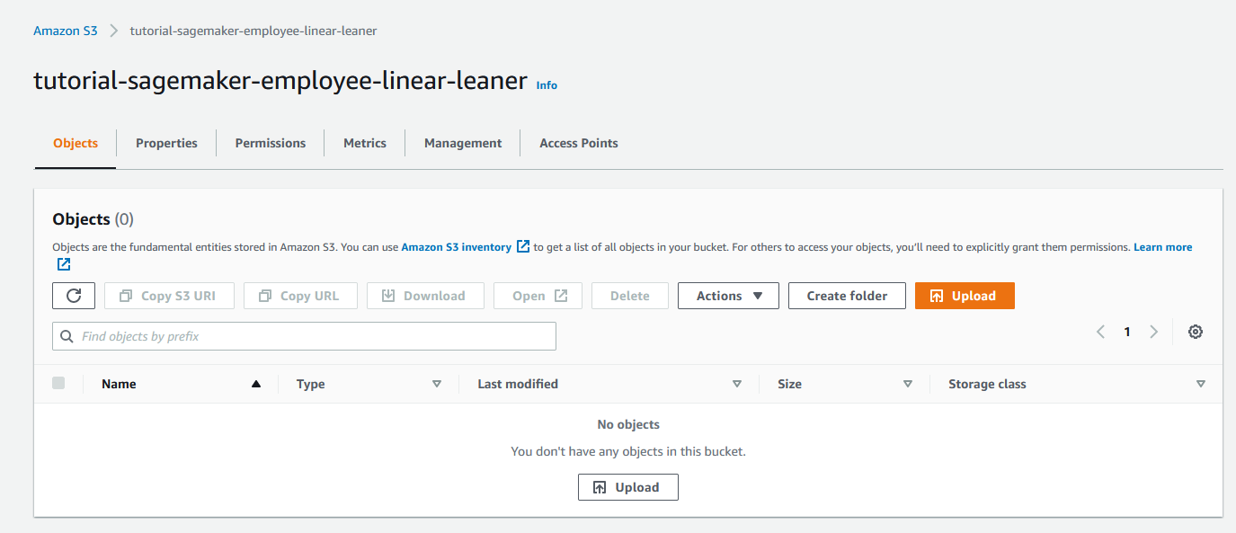
Data in Sagemaker is generally stored in S3 Buckets, both the raw data input and the output. Therefore let us go ahead and create an S3 Bucket for this tutorial that we can reference throughout.
tutorial-sagemaker-employee-linear-learner
Ground Truth
Ground Truth is where we manage all of our raw data that will be fed into the model. Label and shape the data.
Notebook
Notebooks are Python based Jupyter notebooks where we define our machine learning algorithm. Every machine learning model requires a Notebook. Jupyter notebooks are really a small piece of software that must be hosted somewhere, similar to a piece of blogging software like Wordpress. Typically with a managed service or on a virtual server like an EC2 instance. AWS Sagemaker provides managed notebook instances as a function of the microservice.
Create Notebook Method 1: Traditional
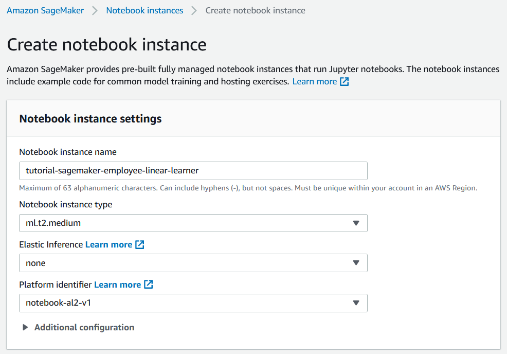
While configuring the notebook we assign or create an IAM role for the notebook to access S3 resources, and while doing that we can restrict the notebook to the tutorial-sagemaker-employee-linear-learner bucket that we created earlier.
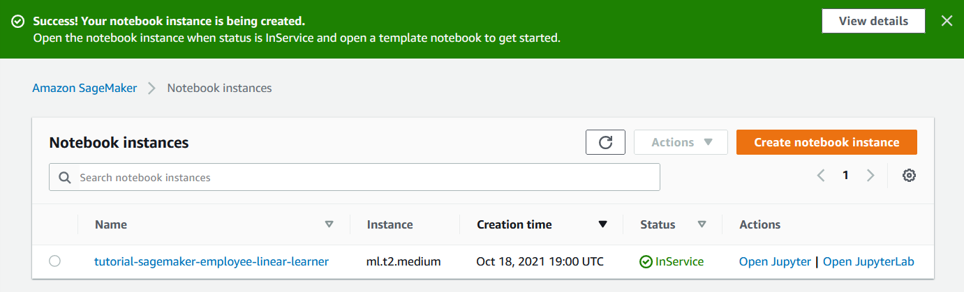
After the notebook has been provisioned we can launch the notebook with "Open Jupyter".
And we can see that we have a blank Jupyter instance running on an EC2 instance which has IAM access to our S3 bucket.
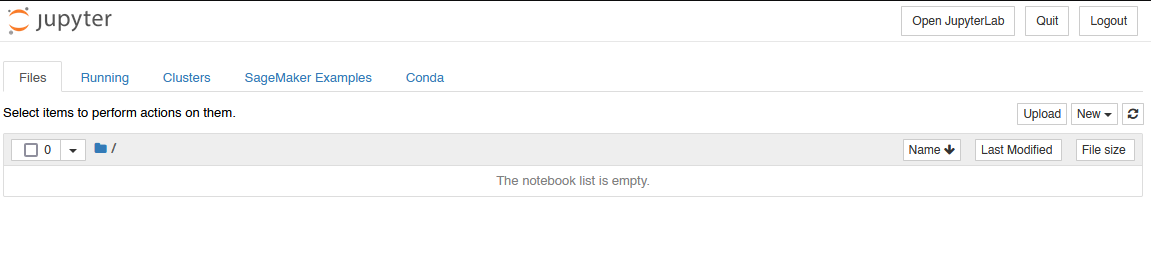
And from there we can upload our sample data and import a notebook.
Create Notebook Method 2: Sagemaker Studio
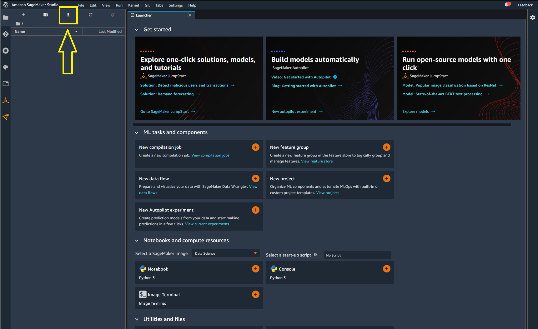
Start by creating a SageMaker Domain and Username. The first time you do this you will be prompted to select a vpc and subnet. I found that one of my default vpc subnets worked, and the other did not. If you pick the wrong one you will have to delete the Sagemaker domain and recreate it to solve this issue.
Then we just click "open studio"

When prompted to select a Kernel we will choose Python 3 (Data Science) for now. And if we are successful we will get SageMaker Studio loaded and we can start uploading notebooks and datasets by clicking on the upload button highlighted here in yellow.
Then we just double click on our notebook that we have uploaded to open it.
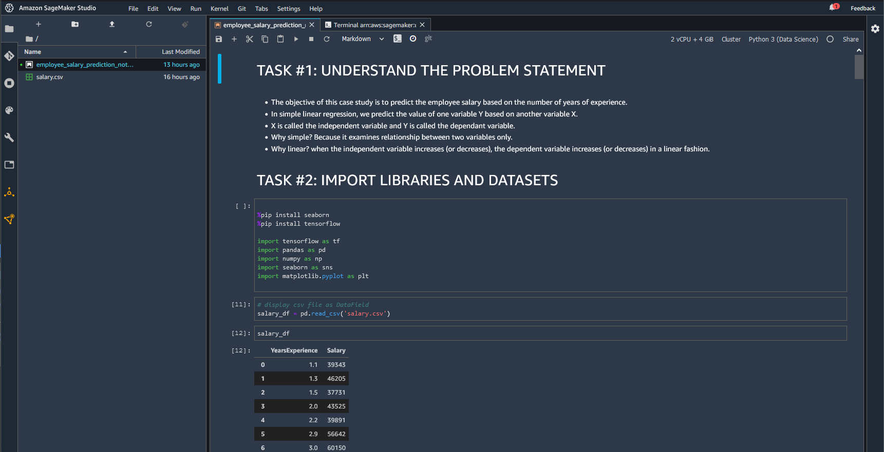
Import Libraries
Coming from the world of Javascript i'm still wrapping my head around these Jupyter notebooks and this crazy mixture of Markdown and Python and live running code that they have going on here. Starting off we are going to use a Python code block to import some key libraries. And it then appears that these libraries will be available for use throughout the whole notebook. We will import the following:
- tensorflow: "a free and open-source software library for machine learning and artificial intelligence. It can be used across a range of tasks but has a particular focus on training and inference of deep neural networks. Tensorflow is a symbolic math library based on dataflow and differentiable programming"
- pandas: "a fast, powerful, flexible and easy to use open source data analysis and manipulation tool, built on top of the Python programming language"
- numPy: "a library for the Python programming language, adding support for large, multi-dimensional arrays and matrices, along with a large collection of high-level mathematical functions to operate on these arrays"
- seaborn: "Seaborn is a data visualization library built on top of matplotlib and closely integrated with pandas data structures in Python. Visualization is the central part of Seaborn which helps in exploration and understanding of data. One has to be familiar with Numpy and Matplotlib and Pandas to learn about Seaborn"
- matplotlib.pyplot: "a collection of functions that make matplotlib work like MATLAB. Each pyplot function makes some change to a figure: e.g., creates a figure, creates a plotting area in a figure, plots some lines in a plotting area, decorates the plot with labels, etc."
import tensorflow as tf
import pandas as pd
import numpy as np
import seaborn as sns
import matplotlib.pyplot as plt
Code blocks can be run with keyboard shortcut shift + enter
We are getting an error these packages are unrecognized so we need to install some of the base packages using the new IPYthon commands
📘 Amazon SageMaker: Package installation tools
%pip install seaborn
%pip install tensorflow
Import Dataset
Our dataset for this tutorial is a simple csv file with two columns; employee Years Experience and salary titled salary.csv, which we have previously imported into our root directory, so we can now display in a DataFrame using the pandas.read_csv function
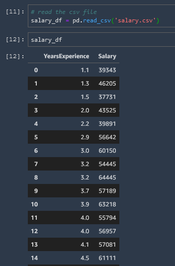
Note the variable that we have used salary_df to indicate that this is a DataField.
Exploratory Data Analysis and Visualization
Now that we have defined the data into a DataField we can use our packages to perform all sorts of useful explorations and visualizations.
Null Values Heatmap
This heatmap of null values is rather boring (since there are no null values) but will be very useful later on.
# check if there are any Null values
sns.heatmap(salary_df.isnull(), yticklabels = False, cbar = False, cmap="Blues")

Info & Statistical Summary
We can get some quick basic information about our field as well as a statistical summary table
# Check the DataField info
salary_df.info()

# Statistical summary of the DataField
salary_df.describe()

Corresponding Max Value
Scan the DataField for the row with the maximum salary, then show the years experience correlated with that row.
# Selecting the row with the highest salary
max = salary_df[ salary_df['Salary'] == salary_df['Salary'].max()]
#print entire row
max
#print years experience only
max['YearsExperience']

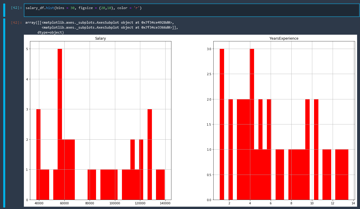
Histogram
Using the Matplot library to create a histogram
salary_df.hist(bins = 30, figsize = (20,10), color = 'r')
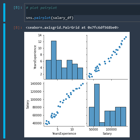
Pairplot
Using the Seaborn library to create a pairplot
# plot pairplot

sns.pairplot(salary_df)
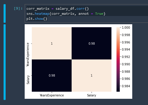
Correlation Matrix Heatmap
corr_matrix = salary_df.corr()
sns.heatmap(corr_matrix, annot = True)
plt.show()
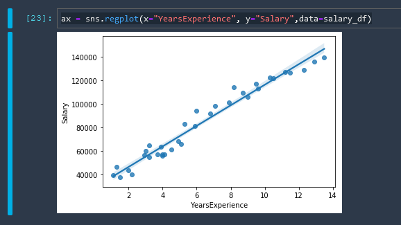
Linear Regression
A basic linear regression using Seaborn
Seaborn Linear Regression Tutorial seaborn.regplot reference
ax = sns.regplot(x="YearsExperience", y="Salary",data=salary_df)
Training & Testing Dataset
Now we need to shape our data into training and testing datasets. The training dataset is what is used to guess the linear model, and then the testing dataset is used to test the model for accuracy. First let us assign some variables to our data.
X = salary_df[['YearsExperience']]
y = salary_df[['Salary']]
Note that X is uppercase and y is lowercase. It is a convention in machine learning models that input features are all uppercase
X is our independent variable and y is our dependent variable
.shape
The .shape function just gives us the dimensions of our data as (rows, columns)
X.shape
(35,1)
y.shape
(35,1)
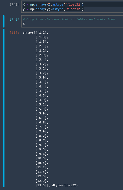
Convert to NumPy Array
For information regarding the float32 number format check these resources
Wikipedia: Single-precision floating-point format
Let us convert our variables now to arrays in the float32 number format
X = np.array(X).astype('float32')
y = np.array(y).astype('float32')
Then we will split the data into training data and test data. The train_test_split function does this for us easily.
# split the data into test and train sets
from sklearn.model_selection import train_test_split

X_train, X_test, y_train, y_test = train_test_split(X, y, test_size = 0.2)
We can then test this by checking the shape of our output arrays.

We can see the updated shape of our new array objects and also that the data has now been shuffled.
Train Linear Regression With SkLearn
We are not using SageMaker built in algorithms here yet
Before we get into how to train a linear learner model using the Sagemaker algorithms, let's go over how to do this briefly with SkLearn.
# using linear regression model
from sklearn.linear_model import LinearRegression
from sklearn.metrics import mean_squared_error, accuracy_score

regresssion_model_sklearn = LinearRegression(fit_intercept = True)
regresssion_model_sklearn.fit(X_train, y_train)
The fit intercept value determines whether our line is forced to start in the origin (fit_intercept = False) or whether we can have a b value and our line can start somewhere on the y-axis (fit_intercept = True)
And we then fed in the training data that we shaped. So we have successfully trained a model now.
LinearRegression(copy_X=True, fit_intercept=True, n_jobs=None, normalize=False)
We can then test the accuracy of our model with our test data
regresssion_model_sklearn_accuracy = regresssion_model_sklearn.score(X_test, y_test)
regresssion_model_sklearn_accuracy
and we have achieved greater than 96% accuracy
0.9645654317630646
and so we now have our parameters for our model of y=mx+b
print('Linear Model Coefficient (m): ', regresssion_model_sklearn.coef_)
print('Linear Model Coefficient (b): ', regresssion_model_sklearn.intercept_)
Linear Model Coefficient (m):  [[8804.039]]
Linear Model Coefficient (b):  [29180.527]
Evaluate Trained Model Performance
We are not using SageMaker built in algorithms here yet
Now let us use our trained model to make some predictions. Remember that we are trying to predict Salary given a particular Years of Experience
.predict()
The sklearn .predict() method can be run on a regression model, with the parameters given to it as an argument. For example:
y_predict = regresssion_model_sklearn.predict(X_test)
Which gives us an array of the predicted salary values.

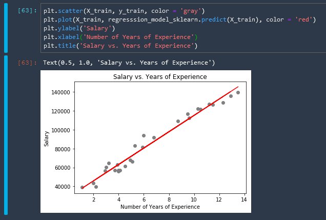
plot the model
We can plot our model that we have created on top of a scatterplot of our training data with the following matplotlib functions
plt.scatter(X_train, y_train, color = 'gray')
plt.plot(X_train, regresssion_model_sklearn.predict(X_train), color = 'red')
plt.ylabel('Salary')
plt.xlabel('Number of Years of Experience')
plt.title('Salary vs. Years of Experience')
I really am liking this whole python thing much more than I thought I would. These statistics libraries are so easy to use and they work flawlessly... this Jupyter ecosystem is fantastic.
predict given a specific input
Let's do one last example here where we find the salary prediction, specifically for a person with 5 years experience.
num_years_exp = [[5]]
salary = regresssion_model_sklearn.predict(num_years_exp)
salary
array([[71842.20898438]])
Automated Amazon Reports
Automatically download Amazon Seller and Advertising reports to a private database. View beautiful, on demand, exportable performance reports.